Showing posts with label drawing. Show all posts

7.04.2014

Llama Man Memories


Here's another new comic, about my first performance of Night City at Brain Frame 2, my first time bringing Llama Man to the stage. This page will be published in the Brain Frame Yearbook.

At the Yearbook party last week, I observed how popular it was to page through the print proof. People would grab a copy and sit in the corner for 20 minutes, myriad expressions flickering over their faces. Someone told me "I could read this for days." Another, a close friend and repeat Brain Frame performer, admitted that he hadn't been planning on buying the book. "$25 is a chunk of change," he said, "even for something I knew would be so nice." Extending his hands, he continued, "but then I saw it and you know, I really got that same feeling that I did in high school. This isn't just some thing I've participated in off and on. This is my community. These are my friends. This is the last three years of my life, and it's beautiful, and I realized that I need it, so I just bought one."

In three days, on Monday, July 7th, we need to buy all the books we can to have them ready at the last show. This means that if you want a book, you need to buy it now. I can't afford much overhead for purchasing extras - a shame, since I know seeing the book in person is the most effective advertisement.

This effort is 150% selfless. Each book costs $5 more to make than the price of sale (ever wonder why your high school book cost $60?). I still need to raise $2,223 by Monday. Anything that doesn't come from pre-sales will come out of my pocket. Please, put faith in your future (and your past) and buy a book this weekend.

Click here to pre-order a Brain Frame Yearbook or
Click here to buy an ad in the back of the book or
DONATE to help us make this happen. Thank you!

6.23.2014

Recent Days (Closure)


Right out of school, a month before starting Brain Frame, in the cosmic summer of 2011, I began this autobiographic comic called Recent Days. I performed some of it at the first Brain Frame, and some more at the first anniversary (BF7). I got to around seventy pages before abandoning the book. Here, finally, the story finds closure. This 2-page spread will be printed in the Brain Frame Yearbook, released this August at our third anniversary (BF19) and final show.

Please pre-order a Brain Frame Yearbook or
Buy an ad in the back of the book or
DONATE to help us make this happen. We need to raise $7750 by July 1st. Pressure's on and coffers are slim.

6.21.2014

The Brain Frame Yearbook

Let me tell you about the Brain Frame Yearbook.


First of all, it's really a yearbook. We've made much ado, rightfully, about the fact that it will be a hardbound, leatherette, foil embossed ledger. There are portraits and autograph pages and photos and superlatives.

Second of all, it's way, way more than a yearbook. The portrait pages include everyone who's ever performed at, accompanied, documented, and staffed Brain Frame - just shy of 200 individuals. They're all self-portraits, ranging from actual repurposed yearbook photos to photoshopped snapshots to drawn images.


The bulk of the book revisits every Brain Frame event from the past three years (29 in all) chronologically. Every pre-show promo blurb I wrote for Facebook; every detailed performance summary for Tumblr (each one a single sentence, a secret challenge to myself instituted around the time of BF3); every poster lies in these pages. Also photographs, captioned of course, as well as personal content from a vast and varied cross section of Brain Frame community members.

Some people have remembered Brain Frame in original comics. Some have written essays, poems, or "letters to the editor." All of these writings include illustration by yet another set of generous, talented, diverse artists.

Nate Beaty's comic about Brain Frame 3

There's more. A few humorous 'op-ed' pieces (also illustrated); a three part special feature on poster process (A Toast To Posters: with your host, the Poster Ghost); a spread of my costumes (not my idea); the winners of the Brain Frame Superlatives illustrated by Kevin Budnik; a Brain Frame Phrenology page by Jamie Davida Lee; a maze; some quizzes; "Oofo Fakts" scattered throughout; and lots and lots of little drawings in the margins.

Clay Hickson's illustration for Brain Frame 12

Let's pause for a minute. Can you believe it? We started collecting material for this book a month ago. I insist you recognize the unwavering and exhaustive support of my intern Lillie West. She is martyring herself in an email prison for the cause.

Lillie and I and the rest of the Yearbook Club: Ben Bertin, Gillian Fry, Christine Lai, Carter Lodwick, Emma Rand, Brad Rohloff, and Nicki Yowell, have been meeting 2-5 times every week to get this done, and slaving away in between. We have to finish by the first of July - this weekend I'm not going to sleep. None of us are making money. We're all buying our own books.


In order to print to our standards, each 160-page, half color, half B&W book will cost $25.93 to make. We're selling them for $25. Pre-sales are live now, and essential to our success. CLICK HERE to reserve your yearbook.

Why? Because it's worth it. Because the whole point is celebrating and embracing the community that has flourished around Brain Frame, and I recognize that this community is not made up of wealthy people. We're hoping to make up the costs through DONATIONS (please donate if you can please please) and ad sales. You can buy an ad NOW for your business, or to commemorate the accomplishments of your loved ones (or enemies). We need ad copy by July 1st! CLICK HERE to buy an ad.


Why else? Because let's face it, Brain Frame is important. Over the past three years, I've changed a lot. The show has changed more, and the comics scene - the very definition of comics - with it. This has been an unprecedented outpouring of multidisciplinary experimentation and engagement with the sequential medium, rooted in communal respect and ecstatic ritual. People are moved. I can say this now - I could never say this before - because it has been told to me, over and over, in the artwork that makes up this as-yet-hypothetical Yearbook. Help me. Solidify this. Partake.
One of many Yearbook Drawing Parties

6.02.2014

Jillian


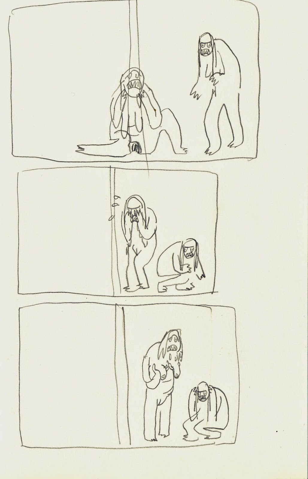
This drawing was commissioned by Halle Butler, intended to become the cover for her first novel, Jillian. The finished copy was to be printed in B&W with gold overlay, filling in the monster spots and pupils, in homage to this cover illustration for Grendel. Here's a digital mockup of the complete design. Imagine the book's spine meeting the right elbow of the crouching monster.


Halle and I met over a year ago to discuss themes and generate ideas. Halle is a good friend; she performed one of the funniest Brain Frame readings ever and we've worked on several films together. She co-wrote Crimes Against Humanity, the feature in which I recently starred. Her work is deceptively mundane, cruel, and hilarious. Jillian is about two miserable female coworkers. As described online:
Halle Butler's debut explores how two people use self-deception and hostility to deal with their lives. Megan, a bitter young medical secretary, takes a break from her overwhelming feelings of social rejection by keeping track of the disgusting habits of her co-worker, Jillian. Meanwhile, Jillian's misguided "go for it!" attitude leads her towards a series of unadvisable decisions.
We settled on two monsters, one lactating and wailing in pain, the other defensive and furious. I sketched several options, carefully considering what should be most visible on the book's spine.


After settling on a composition, I invited Robin Hustle over to model with me. We had a good time contorting our faces and bodies for the camera. Hilarious nude photo shoots are a favorite pastime.

Defining musculature through imagined fur is difficult! It took a long time just to get the poses right. (That crouching pose? Actually impossible.) Once I had the bodies plotted and spots blocked in I began shaping their sub-structures, including genitalia.


I used five different pencils. A 2B mechanical and four wooden pencils, 3-6B. These are the same pencils I use to draw Possession Scenes. When I showed the drawing in progress to Jeremy he said, "Is that your face?"


The completed cover, while treasured by Halle and myself, has proven problematic. The original distributor, Love Symbol Press, dissolved while plans for the book were in progress. Halle pushed her successive distributer, Cubside Splendor, hard to publish this cover, but they declined. Maybe someday, my monsters will see the light. If you saw this book on the shelf, would you scream, or buy it, or both?


2.17.2014

Opining

Updates on art projects have been slim here, I know. In lieu of process posts, here's an aggregate of interviews in my life of late.


The alt-weekly newspaper that I read every week talked back to me! Peter Margasak interviewed me last fall for the Chicago Reader's People Issue. I look forward to this issue every year. It was an honor and delight to be interviewed by Peter, that magnificent critic, and to be photographed and videotaped by such talented fellows. You can see the full, fancy web-spread here.

I especially enjoy these videos, wherein I describe my collaboration for Brain Frame 13, and show off the Llama Man costume. Apparently the video editor, after working on these clips into the wee hours, suffered a rash of nightmares. Success!


This defacement by Kevin Budnik also delights. Thanks Kevin!


Around the same time, I sat down with Sara Drake for a comic-style interview for contemporary art criticism hub Bad At Sports. We sat in my house for a long time, eating bagels and drinking tea, passing our drawings back and forth. You can see the full interview here.


My friends Grant Reynolds and Clayton Shaul recently co-conceived the Twin Freaks podcast. Each episode offers a hearty dose of affable banter regarding a horror film director or subgenre.

In January, Clayton and Grant invited me as a special guest to talk about possession cinema, spurred by my projects Possession Scenes and Uzi's Party. We covered five films in an epic two part episode (sorry).


On the horizon: I'm organizing five Brain Frame-related events in the next two months, one of which is out of town. I'm participating in the second season of Believed Behavior, a comics-subscription online and print experiment. I'm preparing a new comic and a huge show for the last Brain Frame, our third anniversary in August. And, I just started working as the new co-Lead Artist of the Teen Creative Agency at the Museum of Contemporary Art Chicago.

Most pertinent to the subject of this post is the upcoming show BRAIN FRAME: EXPLAINED, a part of the Chicago Zine Fest's Exhibition Day. BF:E will include a 'humorous lecture about the origins and evolution of the show,' delivered by myself; three performances; and an open Q&A which may be led, in part, by my new super-teenager wards at the MCA. Details:

Saturday, March 15th. 3:30-5:00pm in the Auditorium at Columbia College's Conway Center, 1104 S Wabash. FREE and ALL AGES.

There are so many different things I could talk about in this 'humorous lecture.' If you have thoughts as to what you would want to hear, please share them in the comments!

10.07.2013

Strained Piss


This two-part drawing is called Strained Piss and I made it for issue 5 of Corpus Corpus, Paul Nudd's periodic collaborative gross-out zine publication. This issue of Corpus Corpus will be released at the opening of Little Man Pee Pool Party: The Whiz Paddler's Lament, a gallery show curated by Nudd featuring statues from a variety of Chicago artists, all fully functioning fountains inspired by Brussels' Manneken Pis landmark artwork.

The opening is on Friday, the 11th, 6-10pm, at Antena gallery in Pilsen, 1765 S Laflin St. Here's a Facebook event page. You should come, it's a sight.

Here are the original drawn pages for Strained Piss. I'm unsatisfied with the second page. I wish I had eased, lengthened and softened the shape of the implied bowl with thinner piss streams and more outlying splashes. I like my first page, and I bet the compiled book will be a real delight.


5.10.2013

Brain Frame 12


Announcing Brain Frame 12!

An extraordinary feat of engineering. A plane. A bridge. A tower. A tightrope; its walker. A survey; its proctor. A suture; your doctor. An event: the twelfth in a series of performative comix readings.

Join us in another new location (Bridgeport) for the next session of BRAIN FRAME, the show that proves over and over that you can not anticipate how some comic books might be interpreted. Extraordinary engineering feats this episode include: shadow puppets, sanitary napkin disposal bags, a breakdance crew,an eating disorder, some drums and possibly bass. With:

Nate Beaty
Thorne Brandt
Kevin Budnik
Eamon Espey and Lisa Krause
Meghan Lamb
Anne Elizabeth Moore

As well as live synthscapes by Tyson Torsentenson.
Refreshments will be available including gf/vegan goods from local bakery D’ology.

Saturday, May 18th, doors at 8pm, $7

-------------

I designed this poster with Clay Hickson and printed it with Andrew Ghrist. Clay and I (who grew up in the same small town in northern California but didn't meet until both moving to Chicago for the same school, pretty neat huh) sat down and sketched the body of the plane together, then I inked it and drew the people, then Clay drew the squiggles and did all the airbrushing, then I finished the text. Clay has a ton of really beautiful airbrush and wiggle work over at his website, you should really check it out.

The simplicity of this poster was a big relief after the insanity of the last one. Printing was a bit tricky, mostly mixing the colors, but they came out well.


----------

I've been putting out the Brain Frame newsletter for five months, now, and they're getting pretty fancy. This latest effort even matches the poster colors to the email borders, check it out.

5.09.2013

The Infinite Corpse


These are my first panels for the Infinite Corpse. I was assigned to follow Art Spiegelman. I colored it with watercolor pencils. Here's what our panels look like in combination, on the website:


After my submission, you can follow the story either with a strip by John Porcellino or a strip by August Lipp. In the future, there may be more options. That's because the Infinite Corpse is just that - infinite.

This is a project that Trubble Club (mostly Aaron Renier and Nate Beaty) have been working on for a full year. It's a chain comic that never ends, branches off in innumerable dimensions, and currently features the work of over 200 artists, growing daily. Anyone can contribute their follow-up to a random three-panel segment. Submissions are reviewed by a panel of Trubble Club members, but most of them get in, so go ahead! In the beginning, when Aaron was gathering the original strips that make up the framework of the Infinite Corpse, it was in true exquisite corpse fashion. I wasn't able to see any panels except the ones I was following. Now, with the catacombs online, artists will be able to build longer story arcs and reference other parts of the narrative (if they want).

I am flabbergasted by the seamless genius of the Infinite Corpse. I can hardly believe I have such innovative and talented friends. Please, spread the word and contribute.

4.05.2013

Recent Days (Urgent Care)


In between two jobs, running Brain Frame, a few commissions, attending all the coolest Chicago events, making 'boner' puns, and occasionally relaxing, I've been working hard on my autobiographic book Recent Days. It's been in the works for two years. I'm on a tear, now. Here's an amusing update.

3.20.2013

Brain Frame 11

ANNOUNCING BRAIN FRAME 11

You awake one morning from uneasy dreams to find yourself transformed in your bed into a giant insect. What has happened to me? you think. That evening, the hive mind calls you to a new location. Six of your brethren take the stage to enact their own creative transformations. One artist reads from a giant pad of paper, ripping each page as the story unfolds. Another draws a love interest with a skin disease, his artistry projected on a screen above him. A woman wears a coat; a man wears a thong; a trumpeter blares staccato notes in an unknown key. BRAIN FRAME, you hear yourself intone. Expanded comics. Expanded minds.

Featuring:
Bill Cleveland
Krystal DiFronzo
Ian Endsley
Marieke McClendon
Otto Splotch
Jim Trainor

As well as live synth soundscapes by Tyson Torstenson.

IMPORTANT: Brain Frame has moved to a new location! This show will be at Heavy Gel, a new artists studio and resource center. Located on Lake Street around the corner from Western, it's a short walk from the Damen or California Green Line stops, or the Western or Damen bus lines. Street parking abounds.

Local bakery D-ology will be selling vegan, gluten-free, and non-considerate cookies, and BF alumni susan sarandon will be selling Brain Frame's first t-shirts. View the design here.

SATURDAY, MARCH 23RD, 8PM
2335 W LAKE ST, $7

###

Aaron Renier and I designed this poster. You can view a larger version here. It's a hospital noir murder mystery. It begins in the upper left, where the 'Sapphic Slasher' breaks free, killing all her doctors. We can tell from the television in the nurse's lounge on the upper right that she was scheduled to receive a lobotomy. She ties up a nurse, stripping her and taking her clothes, then wanders into the cafeteria where she wreaks havoc, weilding a ketchup bottle like a prosthetic phallus, squirting ketchup all over the tables and floor. After that, she walks past the vending machine into her room, applies lipstick, then finds the Top Doc and, with a little wine and persuasion, leaves the woman naked and sated, smoking a cigarette on her desk. Next, she walks out into the lounge, scrawls names all over the window, and exits the building, escaping in Top Doc's red car.

All of this information and more is visible through careful inspection of this perspective-defying, bird's eye blueprint, Family Circus footstep method, insane print. Aaron and I developed the story and layout together, then he drew all the people and stuff, then I drew all the blood and shadows, composited and colored this poster. Then, last night, Andrew Ghrist and I printed it. If you come to the show, you can buy a copy for the one-time-only price of ten dollars.


2.18.2013

Banana Glove Game


The game goes like this: a referee throws you a banana from a fixed distance. If you catch it, you have to eat it, and then put on a pair of gloves. For every banana you catch and eat, another pair of gloves. Thus: it not only becomes more difficult to catch and peel the fruit, but to stomach each additional banana.

This game was invented as an insignificant joke over four years ago, but its mechanics were so ridiculous that it stuck with me. At one point, I envisioned a Super 8 film about a transgender friend of mine traveling through an interdimensional portal to arrive at a gaggle of octogenarians picnicking in an inner city oasis (I envisioned the empty lots between Paulina and Wolcott, between 13th and 14th streets - former housing projects, I've been told, now vacant grassy areas littered with copses, teeming with lightning bugs in the young summer, surrounded on all sides by rows of abandoned parking meters) while one man in his late 30's tossed bananas to children in the background. Later, I reimagined the game as a comic strip, drawing three quarters of one page before abandoning it.


The banana glove game would occasionally reoccur to me, always making me laugh, never attractive enough to actually materialize. Then, Joe Tallarico sent out a call for short, experimental comics to be published in the upcoming, all-comics issue of Lumpen (he also interviewed me about Brain Frame for this issue). Lacking a better idea, I decided to finally lay Banana Glove Game to rest, as it were. I revisited my truncated attempt and sketched the characters again.


As with every comic I make, now, I knew I would be reading BGG at Brain Frame. So, my focus in the creation of the comic needed to synchronize with my idea for its performance. Anyone who knows me, or knows my art, is aware of my obsession with color separation. It's my favorite way to break apart the structure of an image, regardless of the medium used in its creation, and the resulting product is always beautiful and self-evident, primary parts laid bare. So, what better focal point than color separation for BGG?

I knew that Lumpen would be printed on newsprint, and because Joe offered the possibility of full bleeds, I knew it would have full bleeds. (Never pass up an opportunity for full bleed.) I also know that standard color printing is CMYK. Carl Baratta once told me, in the only college-level painting course I ever took, that using black paint is a cop-out. A rich black, one that makes sense given the surrounding colors, will be created from the sum and opposite of those colors. In this sense, true black pigment can only be used in surrealistic images. While this is clearly a subjective opinion, it's one I admire, perhaps because it demands more work from its believer. So, in choosing the colors for BGG, I opted for C, M, and Y, sans K. This, I felt, would yield the purest, most pleasurable newsprint viewing experience.

I often exclude black from my palette, but it was particularly important in this instance due to the method by which I planned to project the comic. I wanted to use analog slide projectors, each assigned to a color, to project simultaneously, combining on screen to form the complete panels. But first, I had to draw the comic.
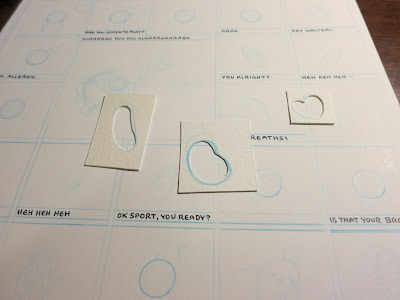


I knew from my ancient sketch that I wanted the sister and brother character to look almost identical. I also wanted to remove any evidence of location from the comic - no perspective, no background information, minimal clues as to where the characters are standing in relation to one another. So, I formatted the pages as almost identical grids, with a few larger panels. I used my circle template to draw perfect circles in the exact middle of every panel featuring the brother or sister, raising the circle by 1/8" in each panel where the boy catches a banana (he's jumping). For the other heads, I cut templates of my own so as to mimic exactly the characters' head shapes - this was especially important considering none of the other characters are fixed centrally in the panel like the brother and sister.


Not only had I restricted myself solely to the use of cyan, magenta, and yellow, I'd also decided that I must use those colors in full, or not at all. No gradients, no intermediate shades, unless they were the combination of two full coats of color. By this rule, I now had at my disposal: cyan, magenta, yellow; purple, orange, green. Because I was also forsaking panel borders, I needed background colors for each character to demarcate the panels' boundaries.

I chose cyan for Walter, since he needed to appear in the most natural setting, and I could add yellow to indicate grass. This left magenta and yellow; I gave yellow to the twins, since yellow is easier to look at and they have the most panels. The referee got magenta, which worked out for his sense of flushed flamboyancy.

I tried, at first, to work out in my head the color scheme for each character's clothing, hair, and props, but it was too difficult to tell what would be successful without viewing the options. I knew concretely, however, the way I wanted the colors to sit. I would keep the linework, coloring it in opposition to the character's background, and underneath those tight lines my color fields would be loose and sloppy. I wanted it to be obvious, for example, when I was overlaying magenta to turn the yellow red-orange. So instead of making transparencies for each color layer, as I would normally, I made transparencies for each type of field: flesh, clothing, and objects.


I also drew a transparency to designate the panel borders. This step would have been relatively easy to do on the computer, but I preferred to do it by hand, minimizing my hours spent staring at the screen. Besides, drawing by hand guarantees just the degree of geometric imprecision necessary to achieve perfection, IMHO. That's four transparencies per page: 12 sheets of tracing paper in all.


After scanning all of these pages into Photoshop and lining them up with one another, cleaning up specks, and filling in my various masks (the shapes you see outlined on the pages shown above), I was ready to test out different clothing/flesh/object color schemes. Here's what my final layering system looks like, next to the completed page:


Before I filled in the colors, the document was just a series of image masks in layers. Like this:


See how the masks don't quite meet at the edges, or sometimes overlap? Like where the referee's glasses don't quite touch his face? That's so I get these beautiful misaligned overlays once the masks are assigned to colors:


When I was filling in everything with 100% hues, I ran into another problem. Not only was the image kind of garish, but I used up all my available tones in coloring the character, and had no color left over to distinguish the linework. So I separated them: I set all of the fill-in hues at 65% opacity, and created separate layers at 100% opacity for the linework and other items I wanted to highlight (mostly the bananas). Here's all the 100% layers, and all the 65% layers, isolated:


To make the banana pattern that gives the page its full bleed, and which I have also made available as computer desktop wallpaper, first I drew out a banana pattern in a gridded sketchbook, then scanned it and isolated the lines.


I copied and pasted, with small, periodic adjustments to randomize the grid, expanding the pattern, then made a second layer, a mask of the positive space of the bananas. Bringing the pattern into the gutters of the finished page, I attributed the banana pattern linework and masking to the 100% cyan layer and the 65% yellow layer, respectively.

Structuring the color layers as well as the mask layers this way was absolutely necessary for producing from them full-color jpegs for industrial offset printing, greyscale plates for risograph printing, and three color slides for every panel.


The slides were hard. I found it was cheaper to buy film and shoot my own slides than have them made digitally. BGG contains 94 panels, so I needed just under 300 slides. I borrowed a camera and tripod from Nate Beaty and shot a practice roll, trying different combinations of black lines, white lines, adjustments in color, etc. I was worried about the yellow and cyan combining to make green. The primary colors of light are RGB - green being a primary color, no other colors combine to make it.

I also learned that instead of negative white space, I needed negative black space. Finished with the test, I shot three and a half rolls of film in which I forgot that, despite the negative space adjustment, I still needed some white in the panels: the children's shirts, the whites of eyes, the gloves, etc. I bought three more rolls of film and reshot from the beginning. I added the white areas to the line layer in each panel (either the cyan or magenta layer), and, those areas on the yellow slides that were intended to combine with the cyan light, I preemptively turned green, to get around the difficulty of mixing green on screen. Everything worked out.


When dealing with pigment, layering multiple colors on top of one another yields a darker composite shade. Dealing with light, the combination of colors yields a similar hue, but one that's brighter than its parts. So, when Banana Glove Game debuted as a multiple slide projection, the colors on display were more ethereal and varied than in the printed version, and lent the presentation a hallucinogenic quality.

Whatever hypnosis BGG exercised over the audience was enhanced by the rhythm of the projectors and the incredible sound design developed by myself and Tyson Torstensen, which Tyson played live at the show. We prerecorded me saying all the lines in the comic, then altered each character's voice slightly to give them different pitches. Tyson added compression, delay, and noise to the tracks. For the performance, we miked the slide projectors and Tyson played glacial, unnerving synthesizer background music over infinite loops of gentle breeze and summer bird sounds, steeping everything in reverb and breaking into ragtime harmonium music when I started flashing the tiki-letter credits. I advanced each slide projector in turn, with a steady 'chunka-chunka-chunka' rhythm.

The instant after the first and before the last projectors had been advanced was an effect I anticipated long before completing the comic and a huge inspiration in my decision-making process. In between each complete panel, the audience saw abstract amalgamations of the two transitioning images. Like this:


With many of the panels so similar to their neighbors, this effect was like a slow moving cross-dissolve animation punctuated by one of the most satisfying analog equipment sounds in existence, over and over and over. I needed two carousels for each projector in order to hold all the slides, so I timed that change over for the panel where Walter slips and falls. I had Grant Reynolds dress up in a fuzzy purple suit and run onstage to slip on a banana peel at that moment.


I'll be performing this comic again next month, on March 9th at Township, as part of the third afterparty for the Chicago Underground Film Festival. I'm planning on sprucing it up a bit with some gloved actors under black lights and a more acrobatic Walter performance. I was calmer presenting Banana Glove Game on stage than I have been debuting any other comic at Brain Frame, which is a testament both to my preparedness and the confidence I have in this piece.