

Back in September, the first feature-length film by Ben Rivers began its first official tour of the United States. The single existing 35mm print, blown up from hand-processed, black and white, anamorphic 16mm film stock, even traveled through my booth at the Siskel. Two Years At Sea is an 88 minute avant-portrait of a grizzled man who lives alone in Scotland's wilderness. Part documentary, part meditation, it received rave reviews from a number of respectable publications.


Ben Rivers is one of my favorite filmmakers, and someone I've assisted with graphics before. Regardless, it came as a great surprise and honor when he hired me to make the poster for the U.S. release of Two Years At Sea. After negotiating a deal, he sent me a link to watch the film. I captured over 40 stills and proceeded to sketch the most compelling ones.


I drew some mock-ups of what pieces I thought might make an interesting poster, and we narrowed down the images through a series of email exchanges. I sketched our top choices again.


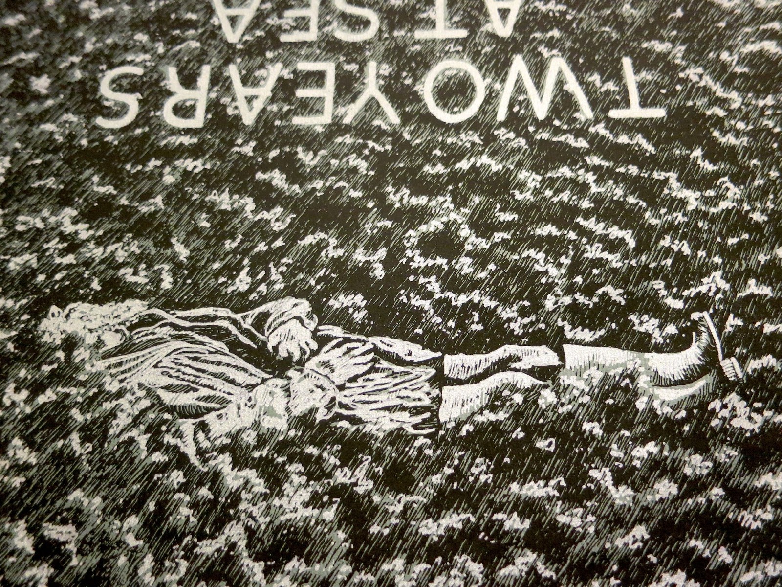
After some more back and forth, we agreed on the final layout of the poster, and the two screen print layers (white-silver and black, on grey paper). The poster would be 24 x 30 (the same size as the BF7 anniversary poster). I chose to draw it a bit smaller, on 14 x 17 paper, so that when the image was blown up my pen marks would be rougher and more obvious.


Okay, so the paper I drew it on wasn't exactly 14 x 17. More like 14 x 16, or something, which accounts for the finished print fitting on the paper more like the emulsion on a polaroid than an image in a proportional matte. And, using a smaller piece of paper lessened the amount of grass I had to draw, which ended up being awesome. Because drawing all of that grass sucked.


Experience it with me. Here's a video of me drawing grass.
Of course, I'll do anything to exorcise onto paper an image in my head. And once all of that texture was down, the feeling I was hoping for - of sweeping seas of dewey brush, waves like clouds, the rippled fabric of a dream background - all of that came together, ultimately uniting the surrounded subject(s). The grass, rendered from a film still, became abstract in its repetition, morphing freely, assisted by the upset in directionality. It was time to frost the tips.


This transparency bears the highlights. It's always funny to draw what will be white in black ink. Unlike a film negative, or a solarized image, the technique in this form retains a hideous goofiness.
Having completed the drawings, I scanned them, enlarged them, and printed them to some fine paper. I sent Ben Rivers' distribution company a run of 25 prints, and gave one to the box office at the Siskel, where it hung in the lobby for a week. My only regret at this point was my paper selection. When I came up with the idea for the ink color and paper scheme, I imagined a darker grey than was available in the size I needed. Luckily, Ben requested I print him a second run for his personal distribution, offering me the chance to buy slightly smaller, darker paper. The blue tint of this version lends additional nautical flavor. I'm very happy with it.


Truly a great blog post chronicling this journey! And somehow I am so relieved to see you wearing socks in the last photo.
ReplyDeleteHey. I love this! Will you sell me a copy??
ReplyDeleteGreat process post, thanks for sharing.
ReplyDelete