Showing posts with label sketchbook. Show all posts

1.28.2013

Two Years At Sea


Back in September, the first feature-length film by Ben Rivers began its first official tour of the United States. The single existing 35mm print, blown up from hand-processed, black and white, anamorphic 16mm film stock, even traveled through my booth at the Siskel. Two Years At Sea is an 88 minute avant-portrait of a grizzled man who lives alone in Scotland's wilderness. Part documentary, part meditation, it received rave reviews from a number of respectable publications.


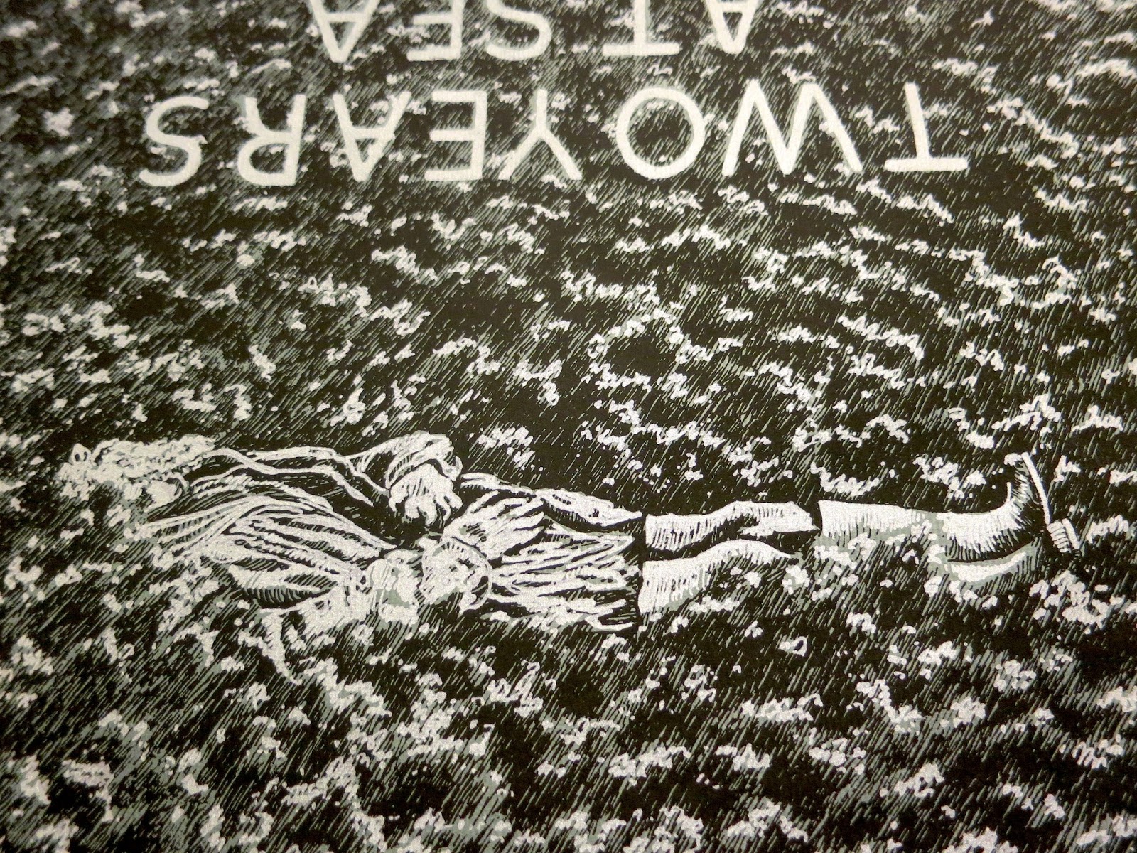
Ben Rivers is one of my favorite filmmakers, and someone I've assisted with graphics before. Regardless, it came as a great surprise and honor when he hired me to make the poster for the U.S. release of Two Years At Sea. After negotiating a deal, he sent me a link to watch the film. I captured over 40 stills and proceeded to sketch the most compelling ones.


I drew some mock-ups of what pieces I thought might make an interesting poster, and we narrowed down the images through a series of email exchanges. I sketched our top choices again.


After some more back and forth, we agreed on the final layout of the poster, and the two screen print layers (white-silver and black, on grey paper). The poster would be 24 x 30 (the same size as the BF7 anniversary poster). I chose to draw it a bit smaller, on 14 x 17 paper, so that when the image was blown up my pen marks would be rougher and more obvious.


Okay, so the paper I drew it on wasn't exactly 14 x 17. More like 14 x 16, or something, which accounts for the finished print fitting on the paper more like the emulsion on a polaroid than an image in a proportional matte. And, using a smaller piece of paper lessened the amount of grass I had to draw, which ended up being awesome. Because drawing all of that grass sucked.


Experience it with me. Here's a video of me drawing grass.


Of course, I'll do anything to exorcise onto paper an image in my head. And once all of that texture was down, the feeling I was hoping for - of sweeping seas of dewey brush, waves like clouds, the rippled fabric of a dream background - all of that came together, ultimately uniting the surrounded subject(s). The grass, rendered from a film still, became abstract in its repetition, morphing freely, assisted by the upset in directionality. It was time to frost the tips.


This transparency bears the highlights. It's always funny to draw what will be white in black ink. Unlike a film negative, or a solarized image, the technique in this form retains a hideous goofiness.

Having completed the drawings, I scanned them, enlarged them, and printed them to some fine paper. I sent Ben Rivers' distribution company a run of 25 prints, and gave one to the box office at the Siskel, where it hung in the lobby for a week. My only regret at this point was my paper selection. When I came up with the idea for the ink color and paper scheme, I imagined a darker grey than was available in the size I needed. Luckily, Ben requested I print him a second run for his personal distribution, offering me the chance to buy slightly smaller, darker paper. The blue tint of this version lends additional nautical flavor. I'm very happy with it.



6.22.2012

Dork Photobooth


Drunk art: I say, "Hey, let's go in the photo booth!" and then I say, "we have to plan it first" because I like making everything difficult for everyone. This is a page of my sketchbook with the organizational sketch and the resultant composition; I'm in the middle, with Melissa on the left and AJ on the right. We got everything right except for Melissa forgetting to take off her sunglasses in the last frame. Yes, this post is worthy of my blog; it's my blog and I say so.

5.22.2012

Sketch Blech


I'm one of those people who gets really possessive and twitchy when you try to look at their sketchbook. It's a personal document and full of unpolished, half-baked ideas - even if you're an artist who is confident in your abilities, it can be painful to reveal the murky pathway to the final show. I've always been jealous of people who fill dozens of quaint, dog-eared volumes with effortless and beautiful doodles. I will never be one of those people.

I was looking through my sketchbook the other day and thinking about this when I started laughing because what I saw was so awful. My sketches are pure strategy, intended only as analytic tools for making something actually artful. As an example, I present my only full diagram of what would become the CUFF poster:


Do you see anything in that drawing? No. It looks like shit. But it was immensely useful in figuring out where in the back of the cave it would recede to nothingness, what the overall shape would be, and the proportion of the crystal in relation to the cavern and the text.

Yes, there are some cool sketches up on this blog, and yes, that sketch at the top looks pretty awesome - I'm being unfair to myself - but if you were to look through my ratty notebooks you'd see a lot more half-assed shit than impressive drafts. Sketch pages like the one at the top of this post are practice for drawing more complex details of unfamiliar textures or forms. I also have pages of transitional sketches. These are drawings that morph as I fill in the details over the body of the subject. For example, this preliminary drawing for the Brain Frame 5 poster:


You can see that I didn't know how to place the monster's legs, or communicate that the eyes were eyes as well as letters. And you can see the rejected mouth idea in the left jowl, which was ditched for the second idea that emerged when drawing the right jowl. I only needed to ink a fraction of this drawing to know how I intended to ink the entirety of the finished monster. And I make a lot of critical notes to myself like that one in the corner - in the end I decided I didn't need iris lines at all.

5.20.2010

One Panel Comics


One of the very first assignments in my most recent comics class was to create a ton of one panel comics. (We started here, then moved to strips, then one page, etc.)


We had to make ten different one-panels, using five characters and five settings that we also had to do multiple drawings of.


I came up with a little boy, a skinny girl, an old man, a mermaid, and a gross blob thing.


I left out a couple of my ten one-panels because they were really terrible, but these ones I thought were ok, and I was pretty amazed that I got them all done in one week.

5.17.2010

Four Panel Comics

This last semester, I took my last comics class at SAIC, Advanced Writing: Show and Tell Comics. It was a comics class in the writing department and was structured mainly around workshop time, talking to your classmates about each other's comics. The pace of this class is intense and a lot of work is required, which is why I took it: I wanted to get better at making comics faster. The four comics here were from one week when we had to make four four-panel strips. One had to be a monologue, one a conversation between one person and an inanimate object, one a conversation between two people, and one a conversation between three. Here they are, in order.


I like these guys at the end. I don't know what they are but when I drew them I was just thinking of them as 'angers'.

11.23.2009

I Have No Interest In Drawing Animals


More from old sketchbook. I like my notes to myself in these, and especially the old lady sitting in front of the mystery tree. Her face is totally fucked up logically, but you get a ton of information from it.

That drawing animals thing is still true, by the way. Animals suck.

11.20.2009

Nautical Warning


 This is the cover of my current sketchbook. Her name was not invented by me, but by Andrew.

11.19.2009

Potluck Planning


And here is something more from that old sketchbook. I used to throw a lot of dinner parties. I love cooking and I love hosting and I think I'm pretty decent at both. In this instance, I was planning a meal for about ten people, including some vegetarians, and because, well, not really because of anything, I drew pictures to go with all my ingredient lists.

Here is another thing from the same sketchbook that I think is really funny. Like, really funny. I don't know what it means so don't ask, although I do vividly recall completing these steps on several occasions.


9.29.2009

Electrolyte Enhanced Doritos


More pages from that old sketchbook. That is a cutout from a Doritos bag in the middle. The brown coffee stain occurred later but I think it really helps with the overall what-is-this-shit aesthetic.

9.25.2009

Brainstorm


From an old sketchbook, circa 2007. I think I was in my Media Practices class (the prerequisite to all film and video classes). I remember my friend Nick leaning over my shoulder, chuckling and getting glared at by the teacher.

6.09.2009

Squishsacks


These are sketchbook pages wherein I've been working on the design for the characters who inhabit my newest comic. They're called 'squishsacks', and they travel in a jellyship. They're bloblike aliens composed mainly of fluid containing their and their species' genetic information. They have three sacks inside of their main body sack which contain only their own genetic information, and they can come together like soap bubbles to communicate through a fluid exchange. They can also meld into the jellyship, a completely organic spaceship shaped like a jellyfish doughnut, which propels through space by manipulation of its many tenticles.