Showing posts with label papercraft. Show all posts

7.08.2011

Matchbook Business Cards


Back in offset printing class (these entries are just a post-graduation clearing house, aren't they?) I had some space left on the side of a print, so I thought I might as well make the most of it.

I had been wanting to make some business cards for myself. Predictably, the thought of just making regular business cards never occurred to me. Instead, I got excited about the possibilities of matchbooks.


I liked the thought of matchbooks with real matches in them. Because I didn't have the capacity to offset print that sandpaper strip that helps you light the paper matches in regular matchbooks, I had to use strike anywhere matches. For this version, I created a design with a stove on the front and a campfire on the back (two ways you can use the contents!) and 'STRIKE ANYWHERE' printed on the spine.

The reason I was able to fit these two pattens on the scrap edge of a larger print is because I made them very narrow (and, by virtue of the mechanics of matchbooks, the unfolded print is also very long). They are narrower than regular matchbooks, being 1" wide as opposed to the more standard 1.5".

The second pattern pushes the boundaries of matchbooks even further. I thought long and hard, trying to come up with another small, thin, disposable object that would be useful and pleasant to dispense in small portable batches. Toothpicks!


This toothpickbook unfolds to show a stretched out, weird face. The upper lip tucks into a reproduction of itself. The toothpicks are lightly glued to each other and then stapled inside, and easy enough to pull out one at a time (like the matches in the previous design).


I know they're decadent for business cards, but I'm also immensely pleased with them as mini art objects. The informative part of the card is stamped on the inside of the front flap. This stamp is one of those design-it-yourself types that come with lots of little rubber letters and symbols which you can then arrange to your liking. They're easy to buy at Staples or Office Depot, and not too expensive.

6.29.2011

Clam Shell Box


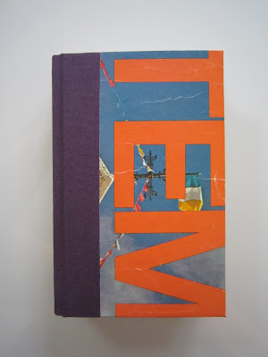
Here's another of my final projects from that artist's books class I took two years ago. This is called a 'clam shell box' because of the way it nestles together, and the broad flexible hinge. It's very similar to the hardback cover of a book with a flat spine, but instead of pages, there's more bookboard making up the sides of the box.


I wanted an interesting cover on the box, so I made two windows in the front bookboard panel, using them as frames for prints of old photographs. I was thinking about a refrigerator (no joke) when I mapped out the two photo-windows.


The rest of the box is made of more bookboard, covered in bookcloth and lined with found sheet music. The slot in the box's bottom wall is there so you can lift out its contents without turning the box upside down. I measured this box to fit the two hardbound books I had just made, but it is also the perfect size for 5x7 photographs, or drug paraphernalia or prophylactics, you know, whatever.

6.21.2011

Round Spine, Flat Spine


Back in spring semester of 2009, I was in an artist's book class. Remember? These two books were the last editions I made, and the fanciest. They're real hardback books, with many signatures, stitched and bound traditionally and really nicely. The quality of these editions is something I'm very proud of. First, the round spine:


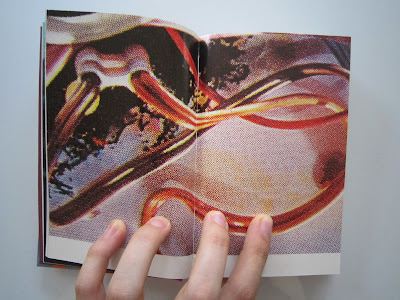
Both books' innards are 50% found paper (posters, wrapping paper, opalescent tissue) and 50% purchased paper. The paper I bought is soft and ribbed, good for sketching or writing. For the round spine book, I used this drawing paper, striped brown wrapping paper, tissue, and the remnants of an old water-stained poster for Guatemala.


And now, the flat spine:


This pages in this book are comprised of the same soft drawing paper and tissue, as well as found posters from the first Austin Powers movie, and The Jimi Hendrix Experience.


•••

OTHER NEWS:

This Friday, I'm participating the seventh installment of the EAR EATER reading series, previously curated by Cassandra Troyan and Sara Drake, and now curated just by Sara Drake (at least this time). Anyway, I'll be doing a performative reading of the prose version of the story of the Squishsacks, and it should be pretty exciting. I will be really nervous, come watch me try not to shake when I talk.

The other readers at the event are:
Halle Butler
Kristin Hayter
Nick Jackson
Anders Nilsen
and Sara Drake.

You should come. It's at 1622 S. Allport St. Apt. #1, commencing between 8-11pm, on Friday, June 24th.

11.27.2010

Dock Ellis


These mini-comics tell the story of Dock Ellis, famous for many things, but mostly for pitching a no-hitter on LSD. He has been immortalized before. This was my attempt.


That wide panel is a splash page in the middle of the book. This comic was made last semester in Surabhi Ghosh's class. The assignment was to write a historical comic.

There is no title to this comic. The covers are made of Thai marbled paper and colored rice paper. There's a window cut out of both covers, creating a frame around the lines, "She said, 'What's wrong with you?' He said, 'I'm high as a Georgia pine.'" It's a nice effect because the color of the rice paper matches some of the swirls in the marbled paper, and the look like they blend together a little bit; the rice paper is also slightly transparent, so after you turn the first cover page, you can see the shadows of emergent words.


9.29.2009

Electrolyte Enhanced Doritos


More pages from that old sketchbook. That is a cutout from a Doritos bag in the middle. The brown coffee stain occurred later but I think it really helps with the overall what-is-this-shit aesthetic.

9.04.2009

Claw Kite


I followed my first etching with another along similar lines. Instead of an arm umbrella, here we see a kite with claws, which is on its way to attack the little boy who's looking for it. I think this images is much more successful than its predecessor. The composition is considered and loops your eye around nicely, and the figures stand out against the plain background much clearer than the girl and her umbrella did.

The reason the little boy's pants and the kite are a different color is because I was working with a technique called chine collé, where a different type of paper is used to fill in an alternate texture or color for an area of the print. This paper is trimmed to the desired shape and size (pants and kite, in this instance), quickly placed on the inked plate, and then the larger paper placed on top of that so that when the whole thing is run through the press, the smaller paper is printed upon and affixed to the larger paper all at the same time.

7.07.2009

Chain Stitch Binding

Aaaaand here's some more bookbinding!


This one's called the Chain Stitch, not to be confused with the Chain Stitch that you use to embroider. The more signatures the better when it comes to this artist's book, because then the stiching on the open spine becomes more apparent. I wish I had a better picture to show you guys.

This is what the open book, between two signatures, looks like:


Were you to open the book within a signature it would look the same as any old book, with the stitching running vertically down the middle. This book is filled with blank pages, as well as glassine sheets (thin transparent paper for archival purposes) and found pages from another old book, which you can see above. The spine has a nice loose but strong feel to it, and is very flexible (obviously).