Showing posts with label screenprinting. Show all posts

5.10.2013

Brain Frame 12


Announcing Brain Frame 12!

An extraordinary feat of engineering. A plane. A bridge. A tower. A tightrope; its walker. A survey; its proctor. A suture; your doctor. An event: the twelfth in a series of performative comix readings.

Join us in another new location (Bridgeport) for the next session of BRAIN FRAME, the show that proves over and over that you can not anticipate how some comic books might be interpreted. Extraordinary engineering feats this episode include: shadow puppets, sanitary napkin disposal bags, a breakdance crew,an eating disorder, some drums and possibly bass. With:

Nate Beaty
Thorne Brandt
Kevin Budnik
Eamon Espey and Lisa Krause
Meghan Lamb
Anne Elizabeth Moore

As well as live synthscapes by Tyson Torsentenson.
Refreshments will be available including gf/vegan goods from local bakery D’ology.

Saturday, May 18th, doors at 8pm, $7

-------------

I designed this poster with Clay Hickson and printed it with Andrew Ghrist. Clay and I (who grew up in the same small town in northern California but didn't meet until both moving to Chicago for the same school, pretty neat huh) sat down and sketched the body of the plane together, then I inked it and drew the people, then Clay drew the squiggles and did all the airbrushing, then I finished the text. Clay has a ton of really beautiful airbrush and wiggle work over at his website, you should really check it out.

The simplicity of this poster was a big relief after the insanity of the last one. Printing was a bit tricky, mostly mixing the colors, but they came out well.


----------

I've been putting out the Brain Frame newsletter for five months, now, and they're getting pretty fancy. This latest effort even matches the poster colors to the email borders, check it out.

3.20.2013

Brain Frame 11

ANNOUNCING BRAIN FRAME 11

You awake one morning from uneasy dreams to find yourself transformed in your bed into a giant insect. What has happened to me? you think. That evening, the hive mind calls you to a new location. Six of your brethren take the stage to enact their own creative transformations. One artist reads from a giant pad of paper, ripping each page as the story unfolds. Another draws a love interest with a skin disease, his artistry projected on a screen above him. A woman wears a coat; a man wears a thong; a trumpeter blares staccato notes in an unknown key. BRAIN FRAME, you hear yourself intone. Expanded comics. Expanded minds.

Featuring:
Bill Cleveland
Krystal DiFronzo
Ian Endsley
Marieke McClendon
Otto Splotch
Jim Trainor

As well as live synth soundscapes by Tyson Torstenson.

IMPORTANT: Brain Frame has moved to a new location! This show will be at Heavy Gel, a new artists studio and resource center. Located on Lake Street around the corner from Western, it's a short walk from the Damen or California Green Line stops, or the Western or Damen bus lines. Street parking abounds.

Local bakery D-ology will be selling vegan, gluten-free, and non-considerate cookies, and BF alumni susan sarandon will be selling Brain Frame's first t-shirts. View the design here.

SATURDAY, MARCH 23RD, 8PM
2335 W LAKE ST, $7

###

Aaron Renier and I designed this poster. You can view a larger version here. It's a hospital noir murder mystery. It begins in the upper left, where the 'Sapphic Slasher' breaks free, killing all her doctors. We can tell from the television in the nurse's lounge on the upper right that she was scheduled to receive a lobotomy. She ties up a nurse, stripping her and taking her clothes, then wanders into the cafeteria where she wreaks havoc, weilding a ketchup bottle like a prosthetic phallus, squirting ketchup all over the tables and floor. After that, she walks past the vending machine into her room, applies lipstick, then finds the Top Doc and, with a little wine and persuasion, leaves the woman naked and sated, smoking a cigarette on her desk. Next, she walks out into the lounge, scrawls names all over the window, and exits the building, escaping in Top Doc's red car.

All of this information and more is visible through careful inspection of this perspective-defying, bird's eye blueprint, Family Circus footstep method, insane print. Aaron and I developed the story and layout together, then he drew all the people and stuff, then I drew all the blood and shadows, composited and colored this poster. Then, last night, Andrew Ghrist and I printed it. If you come to the show, you can buy a copy for the one-time-only price of ten dollars.


3.16.2013

For Purchase


I've opened an online shop. You can check it out here. Currently, merchandise includes heavy hitters like Compiled and Dock Ellis, and then a lot of posters including Go Down, Mr. Square, and Motion Sickness prints. More to come soon, including beautiful Risograph prints of Banana Glove Game.

But wait! There's more! All of the Brain Frame screen prints are ON SALE until this Saturday! Half-size posters are $15, full size $20, and the newest print, seen above, is only $10. This is not a joke. These are totally insane, totally limited edition, totally high quality prints that should be sold for at least $65 if there were any standards at all where art meets commerce. But hey, I'm broke too. Get them while the getting's good.

1.28.2013

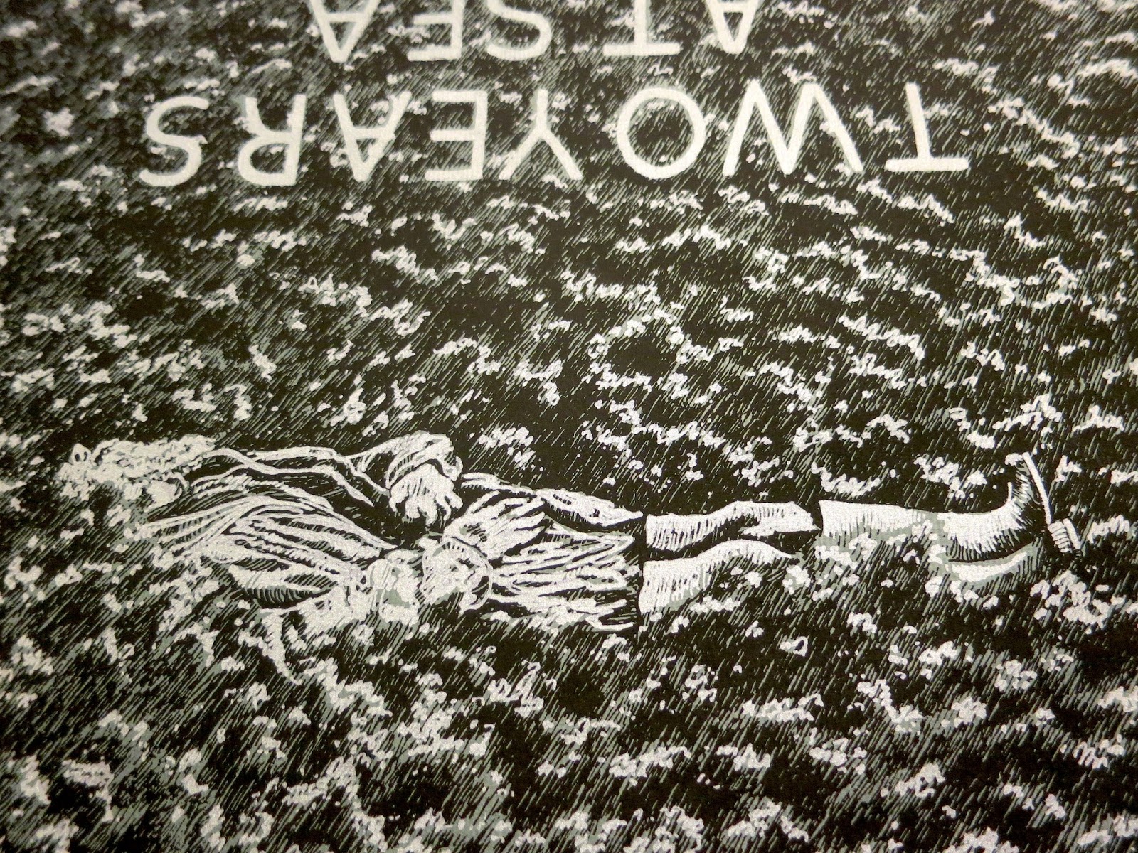
Two Years At Sea


Back in September, the first feature-length film by Ben Rivers began its first official tour of the United States. The single existing 35mm print, blown up from hand-processed, black and white, anamorphic 16mm film stock, even traveled through my booth at the Siskel. Two Years At Sea is an 88 minute avant-portrait of a grizzled man who lives alone in Scotland's wilderness. Part documentary, part meditation, it received rave reviews from a number of respectable publications.


Ben Rivers is one of my favorite filmmakers, and someone I've assisted with graphics before. Regardless, it came as a great surprise and honor when he hired me to make the poster for the U.S. release of Two Years At Sea. After negotiating a deal, he sent me a link to watch the film. I captured over 40 stills and proceeded to sketch the most compelling ones.


I drew some mock-ups of what pieces I thought might make an interesting poster, and we narrowed down the images through a series of email exchanges. I sketched our top choices again.


After some more back and forth, we agreed on the final layout of the poster, and the two screen print layers (white-silver and black, on grey paper). The poster would be 24 x 30 (the same size as the BF7 anniversary poster). I chose to draw it a bit smaller, on 14 x 17 paper, so that when the image was blown up my pen marks would be rougher and more obvious.


Okay, so the paper I drew it on wasn't exactly 14 x 17. More like 14 x 16, or something, which accounts for the finished print fitting on the paper more like the emulsion on a polaroid than an image in a proportional matte. And, using a smaller piece of paper lessened the amount of grass I had to draw, which ended up being awesome. Because drawing all of that grass sucked.


Experience it with me. Here's a video of me drawing grass.


Of course, I'll do anything to exorcise onto paper an image in my head. And once all of that texture was down, the feeling I was hoping for - of sweeping seas of dewey brush, waves like clouds, the rippled fabric of a dream background - all of that came together, ultimately uniting the surrounded subject(s). The grass, rendered from a film still, became abstract in its repetition, morphing freely, assisted by the upset in directionality. It was time to frost the tips.


This transparency bears the highlights. It's always funny to draw what will be white in black ink. Unlike a film negative, or a solarized image, the technique in this form retains a hideous goofiness.

Having completed the drawings, I scanned them, enlarged them, and printed them to some fine paper. I sent Ben Rivers' distribution company a run of 25 prints, and gave one to the box office at the Siskel, where it hung in the lobby for a week. My only regret at this point was my paper selection. When I came up with the idea for the ink color and paper scheme, I imagined a darker grey than was available in the size I needed. Luckily, Ben requested I print him a second run for his personal distribution, offering me the chance to buy slightly smaller, darker paper. The blue tint of this version lends additional nautical flavor. I'm very happy with it.


10.12.2012

Screen Printing Prep (BF8)


Becoming a screen printer was an accident. I learned how as one among many skills during an introductory fibers class. I started out with stencils, printing on fabric. All I knew about paper screen printing was the difference in mesh count; regardless, I ended my days in the fibers department making excuses to print books, on paper.


I've always liked screen printing. I spent an entire holiday vacation scrapping together two screen printed gifts (one fabric, one paper), completing one step of the process at each home-state vacation-spot. I even got paid by some company, one time, to screen print bulk shirts at an event at the House of Blues. On my way home I passed a woman in a fancy dress lying on the sidewalk and vomiting. I learned the rest of my screen printing skills in Offset class.


An offset printer, just like a screen printing human, lays down one color at a time. It can print with any kind of ink: metallic, fluorescent, opaque, transparent, matte, glossy, etc. Unlike most screen printing humans, it easily handles a high volume of paper with maximum precision. Most contemporary books of color, especially professionally printed comics, are offset. Generally, these jobs are printed CMYK:  Cyan, Magenta, Yellow, and blacK being four standardized tones (or 'process' colors) that combine to depict a full spectrum of color.

The best way to combine process colors is to utilize halftones. Halftone dots are little spots of one color, organized in a grid, which are bigger or smaller depending on what percentages of that tone are needed in different areas of the image to make up the many-colored whole.

Taking advantage of CMYK yields a full spectrum of color, sure, but what if you only want to do three color layers? Or you want your print to look weird? Then, you can do what I do.


These are the color files for screen printing the Brain Frame 8 poster. From the left: the file for a dark magenta; a warm, goldenseal yellow; and a bright turquoise-cyan. Click on 'em to see all the itty-bitty halftone dots.

Very early in the BF poster process, I decide which 'spot' colors (any non-process color, which is to be combined in the manner of process colors) will be used for the final screen print. Simon Allen and I agreed that we needed rich tones for the sand and the water. Choosing a dark magenta as our third ink made sense for a few reasons: being the darkest color, it would effectively emphasize the line work (acting as a stand in for traditional black outlines) and, in combination with the blue and yellow, it would yield a near-full range of purples, oranges, and pinks.

Keeping our spot colors in mind, my collaborator and I then begin drawing all the different pieces of the image.


This is the original draft of the BF8 poster, penciled and inked by Simon (who took all the screen printing photos in this post) and myself. Very little of this draft remains in the finished image.


Each successive draft of the poster was drawn on thick transparent vellum. Simon inked the page above to give me cleaner, more precise character outlines. I ended up subtracting his drawings of the dunes, preferring to leave the divisions between sky, water, and land to the color fields from which they would be composed.


I asked Simon to pencil another transparency with shading. Unlike the BF5 poster, which otherwise bears a similar creation story, I wanted every object separate from the background to have organic dimension, instead of flat color fields for shadows. Because the contents of the objects would be printed in different colors than the outlines, I needed them on a separate sheet of paper.


The purpose of this page was not line work, but shape separation. Very few of the lines drawn above are in the finished piece. They exist, rather, to define the boundaries of sky, sand, wet sand, and water; and to more easily identify those areas occupied by foreground objects. Drawing these borders saved me from tracing the outline of every character and every piece of trash on the beach in Photoshop. Instead, I was able to quickly select these areas and save them on a separate layer. This freed me to draw the background without having to avoid all the stuff on top of it.


Another advantage to making all these transparencies is the ability to draw a certain part of the image over and over without having to erase it - you just pick which version you like best. On this page, obviously, I drew all of the background textures. You can see an early version of the clouds, which was rejected for the version on the following, and final, transparency:


You may also observe that I was vastly unsatisfied with my rendering of folds on the giant dead sea-raisin. I think there are four different pages with sea-raisin folds on them. I ended up compositing a few different versions in Photoshop.

Those squiggles are more sea-texture that I ended up not using. The blobbly shapes on the left are the shadows beneath larger objects on the beach, and the black wavy shapes at the top are the shadows which define the dunes.


After scanning in all of those transparencies, cleaning up the layers, isolating objects and choosing colors for everything; after figuring out what percentages of which spot colors are necessary to amalgamate the rainbow of hues I desire; after compiling those percentages into three greyscale files and converting them into halftone dots, resulting in the three B&W images near the top of this post: that's when I put the B&W files back together, replacing the black in each file with its respective spot color, to test my work. The image above looks different than the web version of the poster (visible here). That's because it is a digital mockup of the screen printed version of the poster. It's really worth looking at up close.


That's me and Andrew Ghrist. We are an unstoppable screen printing team. We are both fast, strong, obsessive, and neurotic, with painfully high standards.

I've only been screen printing in earnest, using this method, since Brain Frame 5, in March. That was seven months ago. In that time, I've screen printed seven posters: BF5, BF6, BF7, BF8, Go Down, Mr. Square, and CUFF. I'm better at mixing inks and pulling prints than I have ever been. With every new project, I succeed in simplifying my techniques without sacrificing an anal retentive attention to detail. I love screen printing for the precision and physical strength it requires, as well as the unavoidable imperfections which result.