Showing posts with label color separation. Show all posts
4.04.2016
Cat Tongue
This comic is called Cat Tongue, and was just printed in The Lifted Brow, which is a superb "attack journal" from Australia. This is the first comic that I ever drew for performance first, and print second.
Here's how it looks printed in The Lifted Brow. I am so pleased! You should definitely check out this publication and subscribe if you like experimental fiction and pointed commentary.
Hey, look, my name is on the cover!
Cat Tongue is a story that came to me over a long period of time, and one that bundles several passions neatly together: lesbianism, power tools, beastial fantasy, hallucinatory psychedelia, and of course, color separation. It is also a conceptual follow-up to Go Down, the first (Cat Tongue being the second) in a projected trilogy of comics about female sexuality and oral fixation.
I drew Cat Tongue for performance at the last Brain Frame. I performed it last. It was the last Brain Frame performance ever. (I'm performing it again this month, scroll down for info.) Here's the video:
In this performance, there are three rear-projection screens. The two on either side are illuminated by 16mm film loops. The center screen shows a shifting, CMY color-separated animations of the panels advancing. I am using my trusty vocal effect loop pedal, in combination with an audio feed from one of the 16mm projectors, which is broadcasting the sound of sprocket holes running through an optical sound reader. I am manipulating these two audio inputs (vocal and mechanical) to accompany the hallucinatory narrative. In this performance, analog film machinery = wood shop power tools. When my characters lick the saw and drill, I stand and lick the 16mm projectors.
I drew this comic in about four days, which is remarkable considering I had to draw each page four times. I had to draw each page four times because I needed each color layer to stand on its own as a compelling image, and match imperfectly with its corresponding layers, in order for the separation animation to feel organic and complete.
I began by drawing the machines. Because they are an object of fantasy, they needed to have a different feeling, a different line than the organic materials (flesh, clothing, wood). I staged a photo shoot in an actual wood shop with two friends willing to model. (I captured the 16mm film that would loop in my performance during this shoot, as well.) Drawing on these reference photos and some machine manuals I have, I illustrated all the metal with clean lines, rulers, and high contrast shine and shadow. I penciled in the figures around them. Here's what my base layer page looks like:
Next, I drew three complete pages on top of each base layer, illustrating the cyan, magenta, and yellow parts of the scene. I used a brush pen and tracing paper. I drew each color layer without referencing the others, only the base page and pencil sketches.
I developed a schema to organize the colors consistently. For example: the jeans and overalls would only be illustrated on the cyan page. The shirts would only appear in the yellow layer. The white woman's freckles would only appear in magenta; her goggles, cyan. Here's a comparison of the color layers of two panels on page 3:
To complete the image, I scanned and aligned each layer in Photoshop (you can see my little triplet registration marks on the base page above). I added the machine drawings to all three color layers, so that in the fleeting instances that the animation aligned, the machines would become crisp and black while the rest of the image would continue to appear in flux.
Preparing this comic for print was a novel challenge. I ended up manipulating the text much more than I do in the video animation, for legibility. It was a delight to attempt to replicate the feeling of the cat-transformation on the printed page, by exploding the panels and totally destroying the previous implication of gutters (and thus, time).
I'll be performing Cat Tongue for a second time on April 21st at the Gene Siskel Film Center, as part of my Conversations at the Edge show. This show is a big deal: I'll be enacting three different pieces, one of which is a brand new performative-comix-reading, as well as debuting three short videos. You should come. Buy tickets here.
Labels:
color separation,
comics,
film,
performance,
video
2.18.2013
Banana Glove Game
The game goes like this: a referee throws you a banana from a fixed distance. If you catch it, you have to eat it, and then put on a pair of gloves. For every banana you catch and eat, another pair of gloves. Thus: it not only becomes more difficult to catch and peel the fruit, but to stomach each additional banana.
This game was invented as an insignificant joke over four years ago, but its mechanics were so ridiculous that it stuck with me. At one point, I envisioned a Super 8 film about a transgender friend of mine traveling through an interdimensional portal to arrive at a gaggle of octogenarians picnicking in an inner city oasis (I envisioned the empty lots between Paulina and Wolcott, between 13th and 14th streets - former housing projects, I've been told, now vacant grassy areas littered with copses, teeming with lightning bugs in the young summer, surrounded on all sides by rows of abandoned parking meters) while one man in his late 30's tossed bananas to children in the background. Later, I reimagined the game as a comic strip, drawing three quarters of one page before abandoning it.
The banana glove game would occasionally reoccur to me, always making me laugh, never attractive enough to actually materialize. Then, Joe Tallarico sent out a call for short, experimental comics to be published in the upcoming, all-comics issue of Lumpen (he also interviewed me about Brain Frame for this issue). Lacking a better idea, I decided to finally lay Banana Glove Game to rest, as it were. I revisited my truncated attempt and sketched the characters again.
As with every comic I make, now, I knew I would be reading BGG at Brain Frame. So, my focus in the creation of the comic needed to synchronize with my idea for its performance. Anyone who knows me, or knows my art, is aware of my obsession with color separation. It's my favorite way to break apart the structure of an image, regardless of the medium used in its creation, and the resulting product is always beautiful and self-evident, primary parts laid bare. So, what better focal point than color separation for BGG?
I knew that Lumpen would be printed on newsprint, and because Joe offered the possibility of full bleeds, I knew it would have full bleeds. (Never pass up an opportunity for full bleed.) I also know that standard color printing is CMYK. Carl Baratta once told me, in the only college-level painting course I ever took, that using black paint is a cop-out. A rich black, one that makes sense given the surrounding colors, will be created from the sum and opposite of those colors. In this sense, true black pigment can only be used in surrealistic images. While this is clearly a subjective opinion, it's one I admire, perhaps because it demands more work from its believer. So, in choosing the colors for BGG, I opted for C, M, and Y, sans K. This, I felt, would yield the purest, most pleasurable newsprint viewing experience.
I often exclude black from my palette, but it was particularly important in this instance due to the method by which I planned to project the comic. I wanted to use analog slide projectors, each assigned to a color, to project simultaneously, combining on screen to form the complete panels. But first, I had to draw the comic.
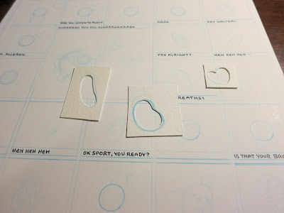
I knew from my ancient sketch that I wanted the sister and brother character to look almost identical. I also wanted to remove any evidence of location from the comic - no perspective, no background information, minimal clues as to where the characters are standing in relation to one another. So, I formatted the pages as almost identical grids, with a few larger panels. I used my circle template to draw perfect circles in the exact middle of every panel featuring the brother or sister, raising the circle by 1/8" in each panel where the boy catches a banana (he's jumping). For the other heads, I cut templates of my own so as to mimic exactly the characters' head shapes - this was especially important considering none of the other characters are fixed centrally in the panel like the brother and sister.
Not only had I restricted myself solely to the use of cyan, magenta, and yellow, I'd also decided that I must use those colors in full, or not at all. No gradients, no intermediate shades, unless they were the combination of two full coats of color. By this rule, I now had at my disposal: cyan, magenta, yellow; purple, orange, green. Because I was also forsaking panel borders, I needed background colors for each character to demarcate the panels' boundaries.
I chose cyan for Walter, since he needed to appear in the most natural setting, and I could add yellow to indicate grass. This left magenta and yellow; I gave yellow to the twins, since yellow is easier to look at and they have the most panels. The referee got magenta, which worked out for his sense of flushed flamboyancy.
I tried, at first, to work out in my head the color scheme for each character's clothing, hair, and props, but it was too difficult to tell what would be successful without viewing the options. I knew concretely, however, the way I wanted the colors to sit. I would keep the linework, coloring it in opposition to the character's background, and underneath those tight lines my color fields would be loose and sloppy. I wanted it to be obvious, for example, when I was overlaying magenta to turn the yellow red-orange. So instead of making transparencies for each color layer, as I would normally, I made transparencies for each type of field: flesh, clothing, and objects.
I also drew a transparency to designate the panel borders. This step would have been relatively easy to do on the computer, but I preferred to do it by hand, minimizing my hours spent staring at the screen. Besides, drawing by hand guarantees just the degree of geometric imprecision necessary to achieve perfection, IMHO. That's four transparencies per page: 12 sheets of tracing paper in all.
After scanning all of these pages into Photoshop and lining them up with one another, cleaning up specks, and filling in my various masks (the shapes you see outlined on the pages shown above), I was ready to test out different clothing/flesh/object color schemes. Here's what my final layering system looks like, next to the completed page:
Before I filled in the colors, the document was just a series of image masks in layers. Like this:
See how the masks don't quite meet at the edges, or sometimes overlap? Like where the referee's glasses don't quite touch his face? That's so I get these beautiful misaligned overlays once the masks are assigned to colors:
When I was filling in everything with 100% hues, I ran into another problem. Not only was the image kind of garish, but I used up all my available tones in coloring the character, and had no color left over to distinguish the linework. So I separated them: I set all of the fill-in hues at 65% opacity, and created separate layers at 100% opacity for the linework and other items I wanted to highlight (mostly the bananas). Here's all the 100% layers, and all the 65% layers, isolated:
To make the banana pattern that gives the page its full bleed, and which I have also made available as computer desktop wallpaper, first I drew out a banana pattern in a gridded sketchbook, then scanned it and isolated the lines.
I copied and pasted, with small, periodic adjustments to randomize the grid, expanding the pattern, then made a second layer, a mask of the positive space of the bananas. Bringing the pattern into the gutters of the finished page, I attributed the banana pattern linework and masking to the 100% cyan layer and the 65% yellow layer, respectively.
Structuring the color layers as well as the mask layers this way was absolutely necessary for producing from them full-color jpegs for industrial offset printing, greyscale plates for risograph printing, and three color slides for every panel.
The slides were hard. I found it was cheaper to buy film and shoot my own slides than have them made digitally. BGG contains 94 panels, so I needed just under 300 slides. I borrowed a camera and tripod from Nate Beaty and shot a practice roll, trying different combinations of black lines, white lines, adjustments in color, etc. I was worried about the yellow and cyan combining to make green. The primary colors of light are RGB - green being a primary color, no other colors combine to make it.
I also learned that instead of negative white space, I needed negative black space. Finished with the test, I shot three and a half rolls of film in which I forgot that, despite the negative space adjustment, I still needed some white in the panels: the children's shirts, the whites of eyes, the gloves, etc. I bought three more rolls of film and reshot from the beginning. I added the white areas to the line layer in each panel (either the cyan or magenta layer), and, those areas on the yellow slides that were intended to combine with the cyan light, I preemptively turned green, to get around the difficulty of mixing green on screen. Everything worked out.
When dealing with pigment, layering multiple colors on top of one another yields a darker composite shade. Dealing with light, the combination of colors yields a similar hue, but one that's brighter than its parts. So, when Banana Glove Game debuted as a multiple slide projection, the colors on display were more ethereal and varied than in the printed version, and lent the presentation a hallucinogenic quality.
Whatever hypnosis BGG exercised over the audience was enhanced by the rhythm of the projectors and the incredible sound design developed by myself and Tyson Torstensen, which Tyson played live at the show. We prerecorded me saying all the lines in the comic, then altered each character's voice slightly to give them different pitches. Tyson added compression, delay, and noise to the tracks. For the performance, we miked the slide projectors and Tyson played glacial, unnerving synthesizer background music over infinite loops of gentle breeze and summer bird sounds, steeping everything in reverb and breaking into ragtime harmonium music when I started flashing the tiki-letter credits. I advanced each slide projector in turn, with a steady 'chunka-chunka-chunka' rhythm.
The instant after the first and before the last projectors had been advanced was an effect I anticipated long before completing the comic and a huge inspiration in my decision-making process. In between each complete panel, the audience saw abstract amalgamations of the two transitioning images. Like this:
With many of the panels so similar to their neighbors, this effect was like a slow moving cross-dissolve animation punctuated by one of the most satisfying analog equipment sounds in existence, over and over and over. I needed two carousels for each projector in order to hold all the slides, so I timed that change over for the panel where Walter slips and falls. I had Grant Reynolds dress up in a fuzzy purple suit and run onstage to slip on a banana peel at that moment.
I'll be performing this comic again next month, on March 9th at Township, as part of the third afterparty for the Chicago Underground Film Festival. I'm planning on sprucing it up a bit with some gloved actors under black lights and a more acrobatic Walter performance. I was calmer presenting Banana Glove Game on stage than I have been debuting any other comic at Brain Frame, which is a testament both to my preparedness and the confidence I have in this piece.
Labels:
color separation,
comics,
drawing,
events,
how to,
performance
6.25.2012
Crystal Concert
Hey, listen. I'm going to be reading Go Down again, at the Burlington, on the 12th of July (a Thursday). The show starts at 9:00pm sharp, and there's a suggested donation of $7. It's gonna be real good and if you're in Chicago you should go. Seriously, this is a great line up. It's a new environment for me; aside from the CAKE benefit at Mortville, I've never been the one performance artist in an otherwise musical revue. Hopefully people will dig it. I think they will.
Xina Xurner make "noise diva drag dance-anthems that ooze sex, death, and decay," Night Terror makes delicious, creepy electronic dance-prog that you can't dance to because it's melting your bones and in a really upsetting time signature, and Gel Set makes "dark electro-pop" with a seductive voice and a morbid sense of humor. Sign up on Facebook here.
I challenged myself to design this poster in under an hour, and succeeded. The actual Photoshopping and printing took several hours more, but on the whole, this flier was a remarkably simple effort for an impressive payoff. Each color is a different color separation layer. In the original file, they all line up perfectly. I wanted them to misregister, however, for perhaps obvious reasons: the computer text at the bottom fragments, and the overlapping facets combine to form really nice new tones.
Labels:
color separation,
events,
fliers,
performance
11.01.2011
Brain Frame 3
I am very proud to announce the third installment of BRAIN FRAME! It's happening a week from this Thursday (that being the 10th of November) at 8pm, at 1542 N Milwaukee (on the second floor). Myself included, there will be five readers:
Krystal DiFronzo
Bret Koontz
Ian McDuffie
Grant Reynolds
It will be sooooo fuuuuuun! I'm serious. Look how excited I am, I'm so excited that I was too lazy to scan in the small version of the flyers, and took a backwards picture of myself holding them instead:
The poster is a collaboration between Ben Bertin and myself. If you can't tell, that's a turkey stuck in the throat of the snake (the snake that's winding through a face skin, a muscle mask, and a skull, and barfing out its brain up at the top there). The snake just ate the whole turkey because it's almost Thanksgiving. You might even say that the snake has Thanksgiving on the brain.
The big version of the poster is actually a seven-color-separation. Each layer (CMY, RGB, K) was printed separately. It's vomitous. When Ben and I finished the drawing, we propped it up on a table in my house and played some metal music, as a test. We nodded our heads and stroked our chins, mumbling "Yes, yes."
If you're on Facebook, there's a page for Brain Frame now. And, um, you should probably 'like' it.
If you attend BF3, you'll see me as a scientist, reading a field report (from the future!) about the squishsacks, complete with alien tissue samples and funny glasses. I'm going first, so get there on time. Here's the documentation, thanks to Jenna Caravello, of my performance at BF2. I'm reading Night City in character as Llama Man. I wrote monologues for him to insert into the narrative of the comic, and later realized that it's the first time I've given him a voice. It was louder than this video makes it seem. You get the idea.
Lyra Hill reads Night City from Lyra Hill on Vimeo.
Labels:
brain frame,
color separation,
comics,
drawing,
events,
fliers,
Llama Man,
performance
9.09.2011
Brain Frame 2
It is happening again.
At The Gallery Formerly Known As Happy Dog, that being located at 1542 N Milwaukee Ave, 2nd Floor, occurring on Thursday, September 22nd at 8 PM.
Reading:
Ben Bertin
Edie Fake
Robin Hustle
Mike Lopez
and me, duh.
The three-color at the top is the big poster - the grid above is all the smaller, two-color fliers. I drew the outlines for this poster while I was visiting Detroit, sitting in bars, hanging out with these guys. You can read it upside down too! See the '2' hidden in the image? Psychedelic. Can you guess how these were made?
Oh, and: brainframe.tumblr.com
Labels:
brain frame,
color separation,
comics,
events,
fliers
7.17.2011
Brain Frame
I am organizing a comix reading event at the end of this month. There will be slideshows, soundtracks, and a spaceship. I am reading along with four dear friends.
BRAIN FRAME: A PERFORMATIVE COMIX READING
THURSDAY, JULY 28TH, 8PM
AT THE GALLERY FORMERLY KNOWN AS HAPPY DOG
1542 N MILWAUKEE AVE, 2ND FLOOR
Sara Drake
Lyra Hill
Nick Jackson
Ian McDuffie
Otto Splotch
Otto and I drew this flier this weekend, and printed it using color copier color separation. We brainstormed (pun intended) the image and then took turns drawing it, first penciling and then inking. I'm totally flattered that you can't tell it was drawn by two people, because I think Otto is so good at comics. It's also great that Nick let us put his number on the flier, because he doesn't have a website for us to link to.
•••
My friend Sara Drake, who will also be reading at Brain Frame, is currently trying to raise money to travel to Cambodia this fall, and teach comics to young women. Sara is a dedicated, intelligent, warm and talented person and is the best candidate I know for this job. Please help her out:
•••
Josh Mabe and Jason Halprin, more friends, are also preparing an important, exciting venture: Chicago 8: A Small Gauge Film Festival. I'm planning on submitting to this festival along with several fantastic filmmakers I know. Josh and Jason are talented, tasteful individuals and master film technicians. Help initiate a hopefully annual cultural event:
Labels:
brain frame,
color separation,
comics,
drawing,
events,
fliers,
performance,
super 8,
zines
4.28.2011
Film Frame
This event is past. Actually, all of the Experimental Film Society events (except one special one) for the spring semester have passed. I am relieved as well as saddened to be done with the constant barrage of minute, mundane tasks that were the running of EFS. (As well as larger, more interesting but similarly time and energy consuming tasks.)
This was a special screening for me. It wasn't the last screening, nor the second to last - those two spots were held by programs of work by Betzy Bromberg, an incredible filmmaker, teacher, and woman in general - but it was the last that I made a poster for. It was also the screening that I had the most to do with creatively. This was one of the few screenings Ross and I programmed that had more to do with a conceptual or stylistic idea as opposed to a convenient grouping of films we wanted to see. As such, it almost feels valid to say that I... curated... this screening.
Anyway, you don't care about that, you (ostensibly) care about the poster. Well, the poster is, you guessed it, more color copier color separation, this time using the technique to separate the different levels of frames-within-frames, avoiding overlapping colors and the combinations that result thereof. The only exciting about this specific instance was the color/frame layer made of two hands.
Most of the images that make up the poster were pulled from Google Image Search, but for the hands I used my MacBook's built in camera to take photos of my own hands. When blown up to 300dpi and 11x17 inches, however, the photos looked pretty shitty. So I printed them out at this size, then drew over them with a mechanical pencil to highlight the shading and creasing in the hands, as well as create a kind of faux-realist crisp resolution and increase visual interest. Then, I scanned the printout back in to the computer and composited it with the rest of the color/frame layers.
I know this story is not all that exciting, but I thought these photos of my hand over-drawing looked kind of nice. Enjoy.
Labels:
color separation,
drawing,
film,
fliers,
photography
Subscribe to:
Posts (Atom)


