3.08.2011

8 Films by Robert Breer


Hey look, another EFS poster! This one is for a screening this upcoming Sunday, showcasing the work of Robert Breer, one of the most influential, important experimental animators ever. If you like experimental animation, check it out. And, if you're in Chicago, you have no excuse not to attend this screening.

This poster was made using a technique Alexander Stewart suggested to me: color separation using the school's color copiers, set to 'single color' output. I hand drew each different color layer with a sharpie on printer paper, then copied each, set to either red, green, or blue, onto the original black printouts. It yielded really rich, mis-registered results, which is exactly what I was looking for. I often find color copies to be super ugly, but I love this method.

The design is a play on Breer's style, as if you could condense his immense body of work into any kind of succinct aesthetic (you can't). Anyway, I tried.


2.19.2011

Dick Pipe


I made Justin a dick pipe for his birthday this year.


I used liquid latex (to which I am no stranger), liquid acrylic paint in some simple colors, and, of course:


Andrew and I picked out the pipe at a head shop in Los Angeles, giggling a lot. Walking into a smoking utensil dispensary with the express purpose of finding the most phallic one is really fun. Those places are full of potential.

I started by coating the entire pipe in a thin layer of latex, leaving plenty of room around the bowl, the carburetor, and the tip of the stem. I was going to build the shape of the pipe with carefully sculpted pieces of toilet paper coated in latex, and they needed a base layer to stick on. I also wanted to get rid of the texture of circles pressed in to the glass.


For these early coats, I used a makeup sponge to apply the latex. Later, when I needed greater control over the texture and smoothness of the layers, I used my fingers.

You can see here that liquid latex has a natural sickly yellow tint to it. This cork contraption was made by Andrew so the dick pipe would have a place to dry without mussing up its coats.


The first layers of toilet paper were the most important, for creating the overall shape of the penis. I wanted the eventual piece to have a slight bow in it, and maybe the hint of a natural curve; I was going for a 'near-erect' look, not a 'rock hard' one, so I had to give it some built in flaccidity. I started by sculpting the head, and then spent a lot of time building up the testicles with bunched up toilet paper - going for realness, again, one ball is bigger than the other.


This process lasted through the duration of my visit to LA. Between each layer, the pipe had to dry. I didn't start adding color until I had the shape almost complete.


These photos don't really do justice to the work. While latex has a tacky, fleshy give to it, the use of the toilet paper between layers added enormously to the feel of the object; the ballsack, especially, has a pronounced squishy quality. My last additions were a couple veins and rippling skin flaps, especially on the bottom of the shaft where the testicles pull together and up, and where the glans meets the stem.

I started the painting process by coloring the veins, balls, and head darker blue and purple than the rest of the organ, giving these areas a nice pink blush as well. I then painted over the entirety with latex tinted with flesh colored paint. In its early stages, the veins were way too intense and the whole thing looked too purple to be healthy.


But it was certainly coming along. I did a little more painting, and layered clear latex over the top to give the skin a transparent quality and lock in the paint. Finally, I textured the last layer of latex around the balls to give them more grip and the implication of wrinkled skin and possibly hair. I finished this piece in the car in the airport parking lot, about to fly back to Chicago.


2.05.2011

Color Separation Test


I've been thinking about this project for a while. I find that often, after figuring something out either as an in-camera technique or as a printing technique, I get excited about figuring the same thing out, but in the opposite situation. Sometimes this is a natural progression, like when we moved in class from learning about matting in camera to matting using an optical printer. Other times it moves backwards, as in this instance.

I'd been thinking a lot about color replacement in black and white images, and color blending through multiple exposure - all on the optical printer - when I realized that I could very easily, and using the same filters, do something similar in-camera. It would work like this: make sure you have a tripod, close your f-stop by 1.5 stops for a triple exposure, place a color filter over the front of the lens, (and compensate for that as well,) shoot, rewind, place a second filter over the lens, shoot, rewind, third filter, shoot. If I wanted the colors to combine realistically on top of one another, I would have to use either red/green/blue or cyan/magenta/yellow combinations (I use both variants in the film above). Hypothetically, this would leave you with an image that looked completely normal wherever the subject matter was standing still, and ghostly and psychedelic wherever it wasn't. If there were objects in a different place during each exposure, they would appear multiple times in different colors.

That's pretty much what I did to make this test film. It's 100ft of 250D, shot on my Bolex Rex-5. Some things that didn't go as planned:

-First of all, and this is glaringly obvious if you watch the footage, the tripods I was using totally sucked. I was home for the holidays and borrowing tripods from very generous friends, but the tripods were meant for small digital cameras and couldn't handle my fat fatty Bolex. That's what causes the rampant misregistration. I was aware during the shooting process that the image probably wouldn't register very well, and I'm glad I did it anyway, because in certain shots (the chairs I like especially, and the goats) it works very nicely and actually adds some interesting compositional qualities - like the multiple arms of the chairs on their sides.

-Secondly, the filters I was shooting through were filthy. That's what causes the ghosty blurs you see moving lumpily around. I borrowed filters from the optical printing room before break (shhh, don't tell) and they are full of crap from grubby fingers and warped from the heat of the bulb.

-Thirdly, the lenses I was using were all old, some in more questionable condition than others, and all non-reflex. As of now, I'm educated as to what to do in such a situation, but at the time I still believed the myth that non-reflex lenses will work on a reflex camera as long as you compensate for the light loss by opening up 1/3 of a stop. So, I was compensating for this myth, the filters, and my triple exposure (which actually ended up working out nicely: in the end I had to open 1/2 a stop from the standard reading for each exposure) and the result was a roll with wildly varying exposure. I feel like I'm usually really good at proper exposures, so that kind of stings.

-Lastly, and this I didn't anticipate: 250D is a relatively low-grain stock, especially Vision 3. But my film turned out exceptionally grainy. I assume it's because every time I exposed, I was underexposing, and the slight grain increase this causes was multiplied by three. You can't really see it in the YouTube upload (sorry) but it's there.

In summary: I am planning on doing this again, but with a really, really sturdy tripod. I'm also planning on trying the same experiment with hand cranking (on a really, really sturdy tripod). The first exposure would be cranked forward, the second back, and the third forward again. Hypothetically, this would lead to really interesting light wavering - not only would the exposure waver with the speed of the crank, it would waver different colors depending on the speeds of the combined cranks - and if I were shooting cars, for example, one color of cars would be driving backwards. The frameline would get fucked up, too. How exciting!

2.01.2011

16mm Films by The Man


Welcome to my last semester! As is fitting in relation to the allotment of my time, the first blog post of spring 2011 is about EFS. The amount of work put into this poster far exceeds what went into the process of drawing (with two Rapidographs, a Pentel Pocket Brush, and ink washes!).

If you're around Chicago for these dates, and you're not dead of a heart attack from shoveling snow, come on by.

12.04.2010

Motion Sickness (Redux)


I drew this a while ago. Last fall (2009) in Offset class I made some posters. It's a three color print, blue, green, and black. I particularly like how the blue mis-registers with the green in the vomit. It adds dimension.


They're really nice, around 14x17 inches, and on thick, sturdy paper - 'desert sand,' it's called, and is the same paper these were printed on.

11.29.2010

A Portrait of a Gentleman


Andrew's little brother Justin wanted me to draw a fancy portrait of him with his dog, Lieutenant Gibson. I finished this in the late summer, and last Saturday we all went to Michael's and picked out a ridiculously fancy custom frame/matte combo. I hope Justin trains a light on it once he hangs it above a fireplace somewhere. Or surrounds it with candles. Something like that.

11.27.2010

Dock Ellis


These mini-comics tell the story of Dock Ellis, famous for many things, but mostly for pitching a no-hitter on LSD. He has been immortalized before. This was my attempt.


That wide panel is a splash page in the middle of the book. This comic was made last semester in Surabhi Ghosh's class. The assignment was to write a historical comic.

There is no title to this comic. The covers are made of Thai marbled paper and colored rice paper. There's a window cut out of both covers, creating a frame around the lines, "She said, 'What's wrong with you?' He said, 'I'm high as a Georgia pine.'" It's a nice effect because the color of the rice paper matches some of the swirls in the marbled paper, and the look like they blend together a little bit; the rice paper is also slightly transparent, so after you turn the first cover page, you can see the shadows of emergent words.


11.10.2010

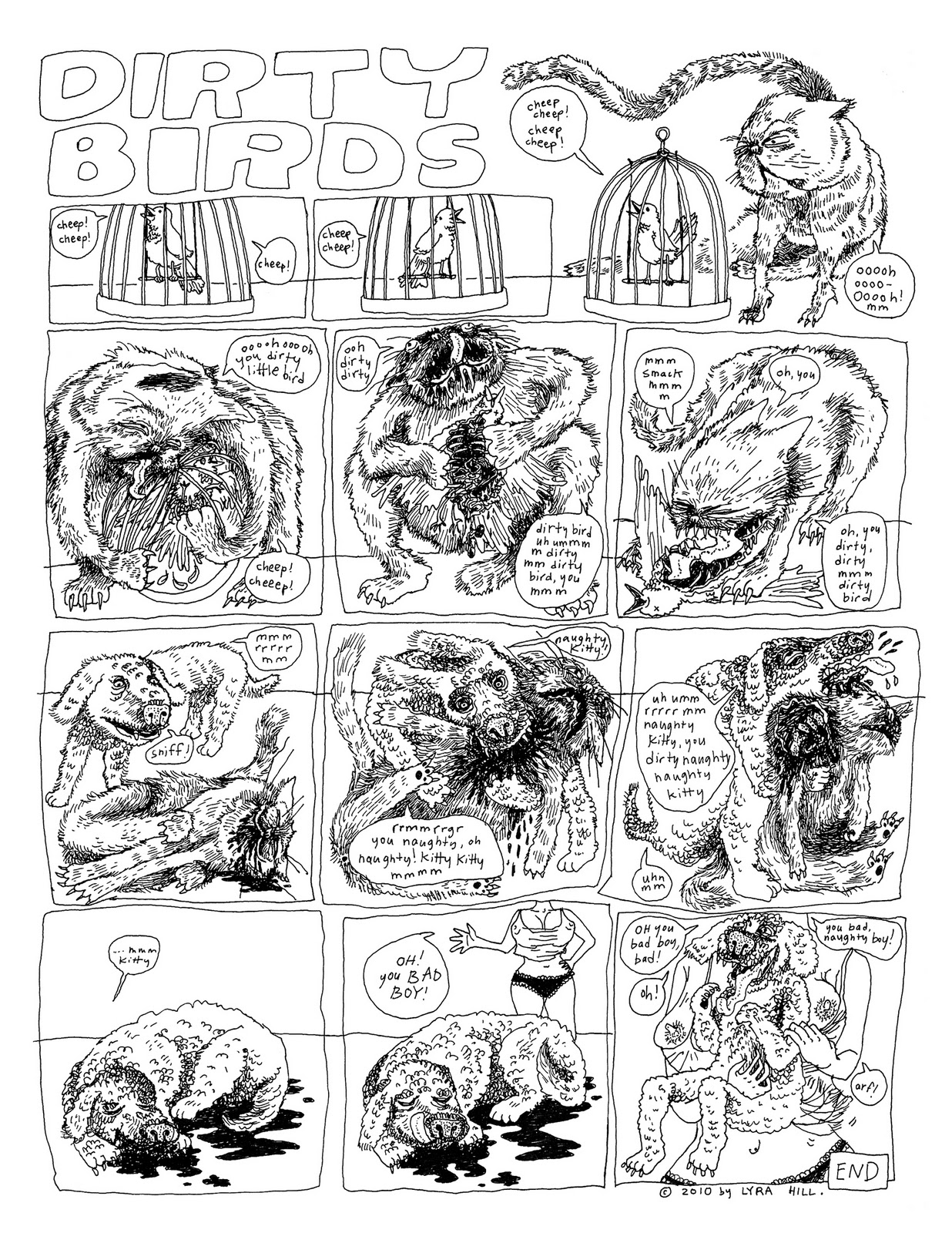
Dirty Birds


So I'm co-president of the Experimental Film Society this year, as well as Xerox Candy Bar, a zine-publishing student group that I've mentioned before.

We're putting out our first issue for the year next week. This is my submission. I've placed it on the page opposite my friend Nick Jackson's first comic, which is breathtaking, and so I feel pretty lucky about that.

In other news, Pop Serial just made its deadline for funding! Thanks very much, everyone who helped pledge and support. There will be a reading for the coming release (haha coming release) of issue #2 on Friday, November 19th at 8:00 PM at 1622 South Allport St. Apt. #1, which is Sara Drake and Cassandra Troyan's apartment. Sara and I, as well as Ben Bertin and Ingrid Olson, will have artwork up at the reading. So stop by, if you're in town.

11.03.2010

Merry Christmas Bike Accident


It must have been a year since I made this run of high-class mini-zines. In my offset printing class, fall 2009, our first assignment was to make a one-color one-off project. I decided to use the opportunity to create a terrible Christmas card.


The last page shows me (this is a true story, about me!) sitting at a table with a bowl of lumpy something, stitches all over my face, eating through a large straw. One word bubble emanating from off-page asks, "is that straw big enough for you, sweetie?" while another, crossing tails with the first, says, "pass the turkey, please." At the bottom of the page is a large message: MERRY CHRISTMAS 2009.

As you can tell if you read the book, this is about the bike accident I had right before Christmas when I was eight years old. I skidded down a hill on my face and it really messed me up and totally ruined the holiday. There's still a chip of cement embedded in my nose. Gruesome closeup:


(Admittedly, slightly hyperbolic. Slightly.) I distributed this along with regular gifts to my friends and fellows last year. Because it was an offset project, I had to do a large run of prints, so I still have about 60ish copies left. I'm thinking of covering up the 2009 part and just giving them out as sick jokes, or selling them as sick jokes for other people to give out.

11.01.2010

Pop Serial #2

HEY GUYS, HEY! My friend Stephen Dierks, a poet and writer and small-press publisher, is trying to make the second issue of his art/literature print magazine, Pop Serial, happen. He has the ambitious and wonderful idea to publish Pop Serial #2 as a perfect bound edition, because, in his own words: "I like visually appealing art objects, and hopefully you do, too. Also, I want the magazine to be more durable and nicer to hold and turn its pages." Amen. Stephen has initiated a Kickstarter fund-raising project to make this happen. If you pledge $10 to the perfect-bound cause, you are guaranteed a copy of the magazine, and if you pledge more, then you may receive a variety of additional printed prizes.


Lots of wonderful artists and writers will be in this edition, including yours truly. Now is your chance to own the first officially printed and published copy of any of my work, ever. Jump on it. Also, help a brother out.