3.22.2011

By and About: Jack Smith


Another day, another poster. Variations on a theme. The natural evolution of practicing printmaking on the color copiers. The next EFS event is a screening of four films, all starring Jack Smith - two by the man himself and one each by Ron Rice and Ken Jacobs, some of the other unknown Warhol Superstars.

Jack Smith is the most important underground filmmaker you've never heard of. Some quotes:
"The only artist I would ever copy" - Andy Warhol
"He was the king of the underground." George Kuchar
"The godfather of performance art." Laurie Anderson
"The only true underground filmmaker." John Waters

Come, if you're around.

In other news, my friend Francisco recently interviewed my other friend Matt O'Shaughnessy and myself on his radio show, GRINGO with Francisco Francisco. We talked about filmmaking, and what EFS does, and all kinds of other fun things. If you'd like to listen to the episode, go here. You can hear my dumb laugh a lot. The music is really loud in the beginning but it gets fixed, don't worry.

3.19.2011

Screenprinting: Christmas Presents


Ever since voluntarily (and happily) becoming unemployed in August of last year, I have been totally broke. But I still wanted to make some kick-ass Christmas presents. I've already written on one example. This is the story of me using all of the people I know in California to help me make two presents for Andrew.

I had a couple ideas. I wanted to make him a t-shirt using an image he had me draw last year, of a bunny holding a drumstick. At the time, he insisted that if he ever got a tattoo, it would be of a bunny holding a drumstick, and that I should draw it for him, just in case. Of course, he's never going to get a tattoo, but I knew he really liked the drawing and figured putting it on a shirt would ultimately be more useful.


I also know that Andrew really likes Carl Sagan, and thinks that the Gold Record project is incredible (which it is). So, since he had just moved and didn't yet have much large wall art, I decided to make a poster of the Gold Record as well. So, while I was in San Francisco, I stopped by Thrift Town, which I visit whenever I can because I miss getting all my shoes there, and picked out the biggest, goldest, most awesome frame I could find. The one I got came with a really cool print in it, a fine line drawing with watercolor washes of this monster scene of humans doing a wide variety of constructive and creative things, like building a boat or practicing ballet or attending the opera or sitting in an office. I went to Thrift Town just looking for a frame, but I ended up using this print as well. It was thematically appropriate.

Obviously screen printing was the best method for both of these projects. Screen printing is the best way to make t-shirts, and I didn't have the capabilities to have a large printer posted any other way (plus screen printing looks way better than some stupid laser printer or something). And, my best friend Zella's boyfriend Dewey has a screen printing-equipped studio in Sacramento. So I started by blowing up each design in Photoshop, then printing out sections on my mom's inkjet, then taping them together to reform the designs.


The Gold Record was more difficult than the bunny. Since the only image of the Gold Record is the relatively low resolution one on the NASA website, I had to do a lot of painful selecting on Photoshop to get a clean black and white stencil image large enough to print 22" in diameter.

Once I had the large images, I had to transfer them to acetate in order to burn the screens. For the bunny, this was easy; I wanted to end up with a simple line drawing, so all I had to do was trace my printout onto acetate with an opaque pen.


For the Gold Record, again, the process was more difficult. Because the positive area of the image was so large, it made no sense to color it with a pen. I considered making a cut-out stencil, but because there are islands areas (unconnected from the rest of the positive image) this wouldn't work either. Dewey ended up having some Rubylith, basically a clear acetate base with a thin red or amber emulsion coating. I'd never heard of it or used it before, but it's great. You can trace your image with an exacto and peel off the emulsion, but still have an intact singe sheet as a base. The emulsion is clear enough to see through, but the right color that it completely blocks the light on the light table when you burn a screen.


Once I'd finished cutting out the details on the Gold Record stencil, I cut the entire thing into a perfect circle. Then I gave Zella a haircut, and we tried to dye her hair with cooked and mashed beets, which didn't end up working out, but looked really gross and cool during the process.


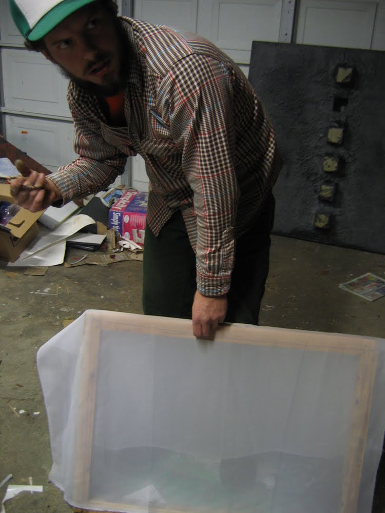
Before burning the screens, we had to stretch them (this part actually happened way at the beginning, before I made the stencils, but anyway). Dewey didn't have any screens as large as I wanted, so he very kindly made some frames and I bought some screen material and we proceeded to make our own.


After stretching the screens, Dewey coated them with emulsion. They took a really long time to set (during which I made the stencils). When they finally hardened (it was really cold and wet in Sacramento last December) we put them up on the light table and burned each screen.


I've only ever screen printed in the school studios before, so this whole process was pretty novel to me. I was incredibly impressed by Dewey's set up and the things he managed to do in a relatively small, not-fancy place. At school we have dry rooms with box fans and chilled emulsion and fancy tubs and sprayers and stuff. Dewey has a used light table and a garden hose, and he manages to accomplish the exact same thing (if it did take a little longer, being as we were at the mercy of the weather). This is a lesson I'm learning in regards to filmmaking as well, and a very useful one considering I'll be graduating in less than two months and won't have access to fancy school equipment after that.

After we burned the screens we sprayed them out and left them to dry.


Next came making the actual prints. We tested the bunny one quite a bit before actually printing the shirt I had picked up. There were some difficulties with the cleanliness of the image, but we managed to get out every bit of emulsion that wasn't supposed to be there, and cover up the places where it was supposed to be, but wasn't.


For the Gold Record print, we ran a couple on blank, dark blue paper before printing the actual image. We printed directly over the poster that had come with the frame I picked out. It had a wonderful effect: the gold ink is about %50 transparent, so it created this big glistening shape that is easily distinguishable from the complicated background, (and recognizable as the Gold Record, if you're familiar with it) but it's still possible to look up close and see the original image.


But the task was not finished! I drove Dewey and Zella back home, and then sped back to San Francisco to accompany my mother to a taping of Retro Night, a weekly show on KOFY TV, a local San Francisco television station. We hosted the It Takes a Thief episode.


After a similarly nostalgic meal, my mother left the city and my little sister Jojo and I went to stay at the house of a family friend family, Marian and Bob and their son Aidan, who helped Jojo and I re-frame the Gold Record print and wrap each present.


You can see a clearer picture of the finished and framed Gold Record print in the photo at the top of this post. That's Andrew, pretending he's not so, so thankful and amazed to receive such nice presents.

Thanks Anne, Zella, Dewey, Dewey's family, Jojo, Marian, Bob, and Aiden! You guys are the best.

3.18.2011

WATW: SIAL


I don't know if you guys are ready for this poster. There's a lot going on. It's pretty terrible, mostly in an intentional way. (But look! It's an eye, and the center of the earth, and the aperture of a lens!) Anyway, if you're around you should most definitely come to this show, it will be killer.

This poster is another, more complicated, take on my new favorite thing: color copier color separation.

3.08.2011

8 Films by Robert Breer


Hey look, another EFS poster! This one is for a screening this upcoming Sunday, showcasing the work of Robert Breer, one of the most influential, important experimental animators ever. If you like experimental animation, check it out. And, if you're in Chicago, you have no excuse not to attend this screening.

This poster was made using a technique Alexander Stewart suggested to me: color separation using the school's color copiers, set to 'single color' output. I hand drew each different color layer with a sharpie on printer paper, then copied each, set to either red, green, or blue, onto the original black printouts. It yielded really rich, mis-registered results, which is exactly what I was looking for. I often find color copies to be super ugly, but I love this method.

The design is a play on Breer's style, as if you could condense his immense body of work into any kind of succinct aesthetic (you can't). Anyway, I tried.


2.19.2011

Dick Pipe


I made Justin a dick pipe for his birthday this year.


I used liquid latex (to which I am no stranger), liquid acrylic paint in some simple colors, and, of course:


Andrew and I picked out the pipe at a head shop in Los Angeles, giggling a lot. Walking into a smoking utensil dispensary with the express purpose of finding the most phallic one is really fun. Those places are full of potential.

I started by coating the entire pipe in a thin layer of latex, leaving plenty of room around the bowl, the carburetor, and the tip of the stem. I was going to build the shape of the pipe with carefully sculpted pieces of toilet paper coated in latex, and they needed a base layer to stick on. I also wanted to get rid of the texture of circles pressed in to the glass.


For these early coats, I used a makeup sponge to apply the latex. Later, when I needed greater control over the texture and smoothness of the layers, I used my fingers.

You can see here that liquid latex has a natural sickly yellow tint to it. This cork contraption was made by Andrew so the dick pipe would have a place to dry without mussing up its coats.


The first layers of toilet paper were the most important, for creating the overall shape of the penis. I wanted the eventual piece to have a slight bow in it, and maybe the hint of a natural curve; I was going for a 'near-erect' look, not a 'rock hard' one, so I had to give it some built in flaccidity. I started by sculpting the head, and then spent a lot of time building up the testicles with bunched up toilet paper - going for realness, again, one ball is bigger than the other.


This process lasted through the duration of my visit to LA. Between each layer, the pipe had to dry. I didn't start adding color until I had the shape almost complete.


These photos don't really do justice to the work. While latex has a tacky, fleshy give to it, the use of the toilet paper between layers added enormously to the feel of the object; the ballsack, especially, has a pronounced squishy quality. My last additions were a couple veins and rippling skin flaps, especially on the bottom of the shaft where the testicles pull together and up, and where the glans meets the stem.

I started the painting process by coloring the veins, balls, and head darker blue and purple than the rest of the organ, giving these areas a nice pink blush as well. I then painted over the entirety with latex tinted with flesh colored paint. In its early stages, the veins were way too intense and the whole thing looked too purple to be healthy.


But it was certainly coming along. I did a little more painting, and layered clear latex over the top to give the skin a transparent quality and lock in the paint. Finally, I textured the last layer of latex around the balls to give them more grip and the implication of wrinkled skin and possibly hair. I finished this piece in the car in the airport parking lot, about to fly back to Chicago.


2.05.2011

Color Separation Test


I've been thinking about this project for a while. I find that often, after figuring something out either as an in-camera technique or as a printing technique, I get excited about figuring the same thing out, but in the opposite situation. Sometimes this is a natural progression, like when we moved in class from learning about matting in camera to matting using an optical printer. Other times it moves backwards, as in this instance.

I'd been thinking a lot about color replacement in black and white images, and color blending through multiple exposure - all on the optical printer - when I realized that I could very easily, and using the same filters, do something similar in-camera. It would work like this: make sure you have a tripod, close your f-stop by 1.5 stops for a triple exposure, place a color filter over the front of the lens, (and compensate for that as well,) shoot, rewind, place a second filter over the lens, shoot, rewind, third filter, shoot. If I wanted the colors to combine realistically on top of one another, I would have to use either red/green/blue or cyan/magenta/yellow combinations (I use both variants in the film above). Hypothetically, this would leave you with an image that looked completely normal wherever the subject matter was standing still, and ghostly and psychedelic wherever it wasn't. If there were objects in a different place during each exposure, they would appear multiple times in different colors.

That's pretty much what I did to make this test film. It's 100ft of 250D, shot on my Bolex Rex-5. Some things that didn't go as planned:

-First of all, and this is glaringly obvious if you watch the footage, the tripods I was using totally sucked. I was home for the holidays and borrowing tripods from very generous friends, but the tripods were meant for small digital cameras and couldn't handle my fat fatty Bolex. That's what causes the rampant misregistration. I was aware during the shooting process that the image probably wouldn't register very well, and I'm glad I did it anyway, because in certain shots (the chairs I like especially, and the goats) it works very nicely and actually adds some interesting compositional qualities - like the multiple arms of the chairs on their sides.

-Secondly, the filters I was shooting through were filthy. That's what causes the ghosty blurs you see moving lumpily around. I borrowed filters from the optical printing room before break (shhh, don't tell) and they are full of crap from grubby fingers and warped from the heat of the bulb.

-Thirdly, the lenses I was using were all old, some in more questionable condition than others, and all non-reflex. As of now, I'm educated as to what to do in such a situation, but at the time I still believed the myth that non-reflex lenses will work on a reflex camera as long as you compensate for the light loss by opening up 1/3 of a stop. So, I was compensating for this myth, the filters, and my triple exposure (which actually ended up working out nicely: in the end I had to open 1/2 a stop from the standard reading for each exposure) and the result was a roll with wildly varying exposure. I feel like I'm usually really good at proper exposures, so that kind of stings.

-Lastly, and this I didn't anticipate: 250D is a relatively low-grain stock, especially Vision 3. But my film turned out exceptionally grainy. I assume it's because every time I exposed, I was underexposing, and the slight grain increase this causes was multiplied by three. You can't really see it in the YouTube upload (sorry) but it's there.

In summary: I am planning on doing this again, but with a really, really sturdy tripod. I'm also planning on trying the same experiment with hand cranking (on a really, really sturdy tripod). The first exposure would be cranked forward, the second back, and the third forward again. Hypothetically, this would lead to really interesting light wavering - not only would the exposure waver with the speed of the crank, it would waver different colors depending on the speeds of the combined cranks - and if I were shooting cars, for example, one color of cars would be driving backwards. The frameline would get fucked up, too. How exciting!

2.01.2011

16mm Films by The Man


Welcome to my last semester! As is fitting in relation to the allotment of my time, the first blog post of spring 2011 is about EFS. The amount of work put into this poster far exceeds what went into the process of drawing (with two Rapidographs, a Pentel Pocket Brush, and ink washes!).

If you're around Chicago for these dates, and you're not dead of a heart attack from shoveling snow, come on by.