1.28.2013

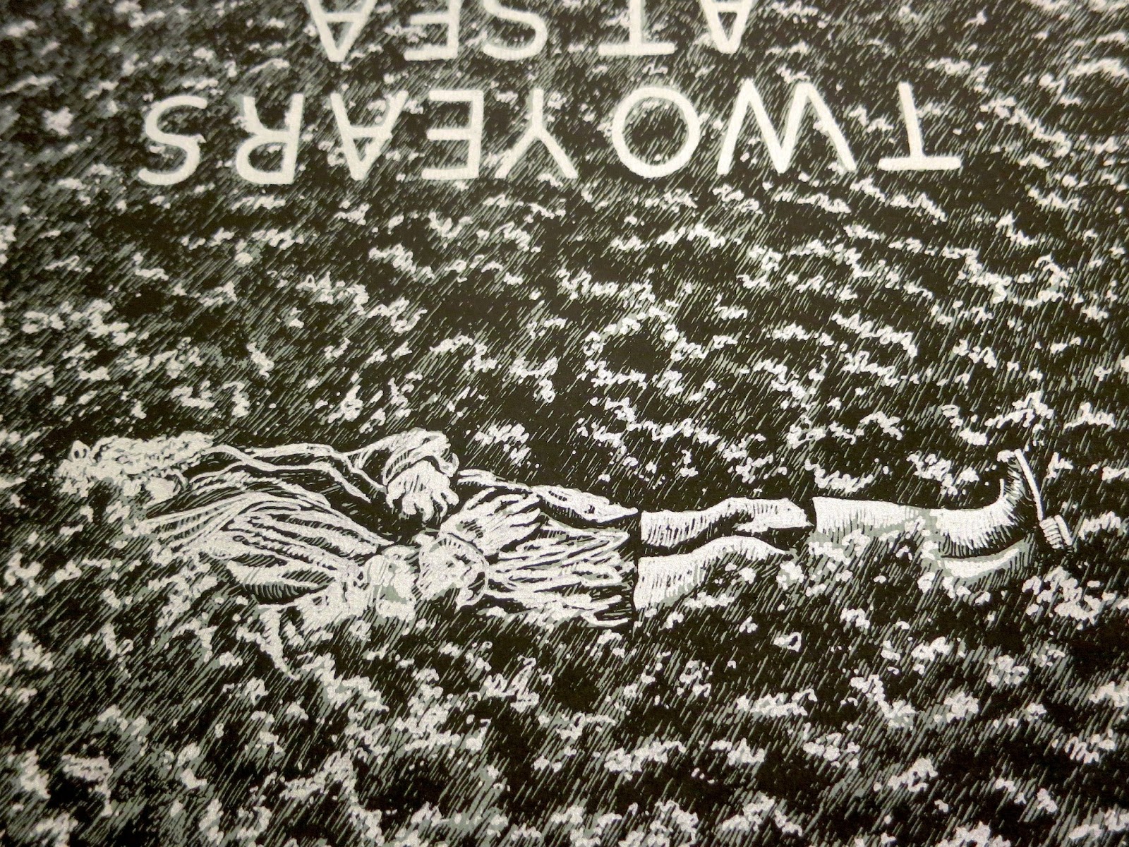
Two Years At Sea


Back in September, the first feature-length film by Ben Rivers began its first official tour of the United States. The single existing 35mm print, blown up from hand-processed, black and white, anamorphic 16mm film stock, even traveled through my booth at the Siskel. Two Years At Sea is an 88 minute avant-portrait of a grizzled man who lives alone in Scotland's wilderness. Part documentary, part meditation, it received rave reviews from a number of respectable publications.


Ben Rivers is one of my favorite filmmakers, and someone I've assisted with graphics before. Regardless, it came as a great surprise and honor when he hired me to make the poster for the U.S. release of Two Years At Sea. After negotiating a deal, he sent me a link to watch the film. I captured over 40 stills and proceeded to sketch the most compelling ones.


I drew some mock-ups of what pieces I thought might make an interesting poster, and we narrowed down the images through a series of email exchanges. I sketched our top choices again.


After some more back and forth, we agreed on the final layout of the poster, and the two screen print layers (white-silver and black, on grey paper). The poster would be 24 x 30 (the same size as the BF7 anniversary poster). I chose to draw it a bit smaller, on 14 x 17 paper, so that when the image was blown up my pen marks would be rougher and more obvious.


Okay, so the paper I drew it on wasn't exactly 14 x 17. More like 14 x 16, or something, which accounts for the finished print fitting on the paper more like the emulsion on a polaroid than an image in a proportional matte. And, using a smaller piece of paper lessened the amount of grass I had to draw, which ended up being awesome. Because drawing all of that grass sucked.


Experience it with me. Here's a video of me drawing grass.


Of course, I'll do anything to exorcise onto paper an image in my head. And once all of that texture was down, the feeling I was hoping for - of sweeping seas of dewey brush, waves like clouds, the rippled fabric of a dream background - all of that came together, ultimately uniting the surrounded subject(s). The grass, rendered from a film still, became abstract in its repetition, morphing freely, assisted by the upset in directionality. It was time to frost the tips.


This transparency bears the highlights. It's always funny to draw what will be white in black ink. Unlike a film negative, or a solarized image, the technique in this form retains a hideous goofiness.

Having completed the drawings, I scanned them, enlarged them, and printed them to some fine paper. I sent Ben Rivers' distribution company a run of 25 prints, and gave one to the box office at the Siskel, where it hung in the lobby for a week. My only regret at this point was my paper selection. When I came up with the idea for the ink color and paper scheme, I imagined a darker grey than was available in the size I needed. Luckily, Ben requested I print him a second run for his personal distribution, offering me the chance to buy slightly smaller, darker paper. The blue tint of this version lends additional nautical flavor. I'm very happy with it.


1.16.2013

Brain Frame 10


ANNOUNCING BRAIN FRAME 10!

The night awaits the warm orb of the coming sun with desperation tantamount only to your yearning for the new year’s first performative comix reading. Six brave artists breathe fire into their creations, bringing them to NEW LIFE! Witness miracles: a trembling science fiction, a devastation, a sweet song, a game, a meditation. All this and more courtesy of:

Ezra Claytan Daniels
Sara Drake with Anna Barnes
Lyra Hill
Grant Reynolds
Andy Roche
Marian Runk

Live sonic landscapes by Tyson Torstensen

1542 N Milwaukee, 2nd floor, 9:00pm, $7

(I made this poster with Jenna Caravello. We worked out the building together, she drew the tiles, the people, and the outside, I drew the lions, the plants, and the text. I colored it all last night and this morning in between shooting 288 slides for my reading. I'll be helping Andrew Ghrist screen print it today. Soooo tiiiired.)

1.07.2013

Banana Wallpaper


Happy New Year!

It's been awhile. I've made a lot of stuff, hopefully I'll find the time to show the world soon. In the meantime, here's some 'digital wallpaper' culled from the background to my new comic Banana Glove Game, which will be published in Lumpen later this month, and which I will be reading at Brain Frame 10, on January 18th. Enjoy the banana madness. I only made this 'digital wallpaper' because every time I see 'digital wallpaper' the fact of its existence makes me laugh so hard. (A tangent: House Fuck was named House Fuck because the idea of an experimental 16mm movie called House Fuck made me laugh so hard.)

11.12.2012

Recent Days (Wedding Page)


Here's another page from Recent Days. These panels are drawn from photographs of my father's wedding. This project has been stalled recently, making it more difficult to start again. The book will be finished in the spring next year, but I'm not exactly sure when. In the meantime, I'm finishing a poster for Ben Rivers, drawing a comic for Lumpen, and incessantly operating the many tendriled beast Brain Frame.

Speaking of Brain Frame, here's a fantastic critical review by Bill Bacarella, recently published on Chicago Artist Writers. Read it!

11.06.2012

Future Shamans


For Halloween this year, I turned Tyson and myself into "future shamans from the year 42069." It took me the three hours preceding the party we attended on Saturday night to build the costumes.


You might recognize the fabric as the final costumes from Untitled (Times For), the extreme in-camera film Ross and I made a year ago. The blue paint is also from that shoot. The spikes are made of mylar, left over from Brenna Murphy's show at CATE, duct taped around cardboard spikes sewn to cardboard bustiers. Here are two dynamic views of the construction:


They were snug, comfortable, and fully adjustable. Always rely on the waist or torso, rather than the shoulders, for structural support. The energy spikes were too powerful to be worn between houses, so we had to carry them like giant mirrored claws in the dark Chicago streets at the witching hour.


I made a costume out of cardboard on the day of Halloween last year, too. Then I went to three parties in a row, and by the end of the night, danced my outfit to pieces. I was a switchblade. This is the only photo of me that was taken. The handle of the knife reached my knees, and the blade was fully retractable.


10.27.2012

Brain Frame 9


WIGGLE YOUR WAY TO BRAIN FRAME 9 ON NOVEMBER 16TH, which is a FRIDAY, at 9:00PM. You just make your way to 1542 N MILWAUKEE and go up to the SECOND FLOOR, then pay SEVEN DOLLARS to see:

David Alvarado
Ben Bertin
Marnie Galloway
Corinne Mucha
Jeremy Tinder
Gina Wynbrandt

I drew this poster in record time with the very talented Joe Tallarico. Ghosts and background psychedelia courtesy of Joe; floating Escher castle, text, and color courtesy of myself. I'm getting better at planning the number of transparencies needed for each poster. Joe finally convinced me to use non-photo-blue pencils, for which I am thankful. Show up. Get down. Perhaps I'll post pictures of the transparencies soon. Happy Halloween.

10.12.2012

Screen Printing Prep (BF8)


Becoming a screen printer was an accident. I learned how as one among many skills during an introductory fibers class. I started out with stencils, printing on fabric. All I knew about paper screen printing was the difference in mesh count; regardless, I ended my days in the fibers department making excuses to print books, on paper.


I've always liked screen printing. I spent an entire holiday vacation scrapping together two screen printed gifts (one fabric, one paper), completing one step of the process at each home-state vacation-spot. I even got paid by some company, one time, to screen print bulk shirts at an event at the House of Blues. On my way home I passed a woman in a fancy dress lying on the sidewalk and vomiting. I learned the rest of my screen printing skills in Offset class.


An offset printer, just like a screen printing human, lays down one color at a time. It can print with any kind of ink: metallic, fluorescent, opaque, transparent, matte, glossy, etc. Unlike most screen printing humans, it easily handles a high volume of paper with maximum precision. Most contemporary books of color, especially professionally printed comics, are offset. Generally, these jobs are printed CMYK:  Cyan, Magenta, Yellow, and blacK being four standardized tones (or 'process' colors) that combine to depict a full spectrum of color.

The best way to combine process colors is to utilize halftones. Halftone dots are little spots of one color, organized in a grid, which are bigger or smaller depending on what percentages of that tone are needed in different areas of the image to make up the many-colored whole.

Taking advantage of CMYK yields a full spectrum of color, sure, but what if you only want to do three color layers? Or you want your print to look weird? Then, you can do what I do.


These are the color files for screen printing the Brain Frame 8 poster. From the left: the file for a dark magenta; a warm, goldenseal yellow; and a bright turquoise-cyan. Click on 'em to see all the itty-bitty halftone dots.

Very early in the BF poster process, I decide which 'spot' colors (any non-process color, which is to be combined in the manner of process colors) will be used for the final screen print. Simon Allen and I agreed that we needed rich tones for the sand and the water. Choosing a dark magenta as our third ink made sense for a few reasons: being the darkest color, it would effectively emphasize the line work (acting as a stand in for traditional black outlines) and, in combination with the blue and yellow, it would yield a near-full range of purples, oranges, and pinks.

Keeping our spot colors in mind, my collaborator and I then begin drawing all the different pieces of the image.


This is the original draft of the BF8 poster, penciled and inked by Simon (who took all the screen printing photos in this post) and myself. Very little of this draft remains in the finished image.


Each successive draft of the poster was drawn on thick transparent vellum. Simon inked the page above to give me cleaner, more precise character outlines. I ended up subtracting his drawings of the dunes, preferring to leave the divisions between sky, water, and land to the color fields from which they would be composed.


I asked Simon to pencil another transparency with shading. Unlike the BF5 poster, which otherwise bears a similar creation story, I wanted every object separate from the background to have organic dimension, instead of flat color fields for shadows. Because the contents of the objects would be printed in different colors than the outlines, I needed them on a separate sheet of paper.


The purpose of this page was not line work, but shape separation. Very few of the lines drawn above are in the finished piece. They exist, rather, to define the boundaries of sky, sand, wet sand, and water; and to more easily identify those areas occupied by foreground objects. Drawing these borders saved me from tracing the outline of every character and every piece of trash on the beach in Photoshop. Instead, I was able to quickly select these areas and save them on a separate layer. This freed me to draw the background without having to avoid all the stuff on top of it.


Another advantage to making all these transparencies is the ability to draw a certain part of the image over and over without having to erase it - you just pick which version you like best. On this page, obviously, I drew all of the background textures. You can see an early version of the clouds, which was rejected for the version on the following, and final, transparency:


You may also observe that I was vastly unsatisfied with my rendering of folds on the giant dead sea-raisin. I think there are four different pages with sea-raisin folds on them. I ended up compositing a few different versions in Photoshop.

Those squiggles are more sea-texture that I ended up not using. The blobbly shapes on the left are the shadows beneath larger objects on the beach, and the black wavy shapes at the top are the shadows which define the dunes.


After scanning in all of those transparencies, cleaning up the layers, isolating objects and choosing colors for everything; after figuring out what percentages of which spot colors are necessary to amalgamate the rainbow of hues I desire; after compiling those percentages into three greyscale files and converting them into halftone dots, resulting in the three B&W images near the top of this post: that's when I put the B&W files back together, replacing the black in each file with its respective spot color, to test my work. The image above looks different than the web version of the poster (visible here). That's because it is a digital mockup of the screen printed version of the poster. It's really worth looking at up close.


That's me and Andrew Ghrist. We are an unstoppable screen printing team. We are both fast, strong, obsessive, and neurotic, with painfully high standards.

I've only been screen printing in earnest, using this method, since Brain Frame 5, in March. That was seven months ago. In that time, I've screen printed seven posters: BF5, BF6, BF7, BF8, Go Down, Mr. Square, and CUFF. I'm better at mixing inks and pulling prints than I have ever been. With every new project, I succeed in simplifying my techniques without sacrificing an anal retentive attention to detail. I love screen printing for the precision and physical strength it requires, as well as the unavoidable imperfections which result.

9.20.2012

Haw Flawrs Blum


This is a book that I made, probably around age 5. It has always been special to me. However, after I started making comic books, I revisited this 'piece' and realized that it is probably the first comic book I ever made. So, yeah. I love this.


9.15.2012

Brain Frame 8


Brain Frame 8 is tonight. 9pm this time, that's a first, also, a keg. I am not performing. I was planning on reading the rest of Recent Days at this show, but then I realized that it would be almost impossible to finish a 150-ish page book in two months at the same time as organizing another Brain Frame, and planning a performance. The stress leading up to Brain Frame 7 was almost unbearable and incredibly unhealthy. So, the reading and release of Recent Days will now occur in January, at Brain Frame 10.

I've reevaluated a few big goals in recent months. Ever since my third year at SAIC, I've been planning to apply for a Fulbright to Iceland. I've wanted to visit Iceland since I wrote a report on it in sixth grade. I would like to make a film there, and I think, if I really gave it my all, I'd be a good contestant for the Fulbright award. My plan was to apply this fall, and then next fall, perhaps from Iceland, apply for grad school.

Of course, when I made that plan, I had no idea that in the fall of 2012 I would be running a compelling, successful comix performance series, or that I would be getting paid to teach filmmakers I respect how to optically print their footage, or that I would be receiving more and more requests for design work, or that my social and creative community would be so alive with passionate ideas and productive energy. So, I'm not applying for the Fulbright. Not right now, at least. And there's a good chance I will apply for grad school soon, but I don't need to think about that just yet; right now, I'm committed to Brain Frame, to finishing my next book, to producing more films. That's more than enough.


It was my birthday last month. Thorne Brandt made this gif for me. Tyson and I traveled to California for ten days. I shot five rolls of S8, which you can see soon, if you care to. Mark invited us to the Academy to a private screening of a new 35mm print (with stereo sound OMG) of Water and Power. Pat and Beverly O'Neill were there, with George Lockwood, and Kate McCabe. I was giddy to meet Pat, seeing as he's one of my favorite filmmakers. He and Beverly know me from Facebook, and, incredibly, they were excited to meet me too. We all hung out on the roof and everybody sang happy birthday, and then we went back downstairs and watched House Fuck and The Mystic in the small screening room. It was the best birthday I've ever had.


Last night was the opening of Afterimage, a show featuring and influenced by the Chicago Imagists, at the DePaul Art Museum, open until November 18th. This sculpture is an exquise corpse cobbled together by Trubble Club, including myself. I painted one of the faces: the guy with five rows of teeth. There's a wall of books curated by Trubble Club, as well. It's a wonderful exhibit and you should go.


These are photos of me on a boat, filming a wedding with my Super 8 camera. The film footage in the above video is what I was shooting. The video was edited by the glowing bride. If anyone wants me to film their wedding on a boat let me know.

---

REMAINING POINTS OF INTEREST FOR WHICH I DO NOT HAVE INTRODUCTORY PHOTO/VIDEO DOCUMENTATION:

1) One of my two jobs is as a project archivist at Kartemquin Films. Kartemquin is the social documentary production house that brought you Hoop Dreams and The Interrupters, among many other incredible films. The archivist team (or A-Team) has started a blog, and you can read my first entry here.

2) Hey, people in Hawick, Scotland, are you going to the Alchemy Film and Moving Image Festival? Cause you should. I wish I could go. And, if you show up at the Tower Mill on Kirkstile at 1:45pm on Saturday, October 27th, you will witness the world premier of my film The Mystic. It's a digital projection, for which I apologize, but it's also the world premier.

3) Hey, what's up Victoria, British Columbia! Are you going to the Antimatter Film Festival? You should. I wish I could go. And, if you happen to catch the last screening of the event, at 9:00pm on Saturday, October 20th, you will witness the Canadian premier of my film House Fuck. On film! Somebody buy me a ticket from Chicago to Canada to Scotland and back to Chicago. Oh, wait, somebody buy me a passport first.