8.26.2011

Join Me On This New Vision Quest


So  Brain Frame #1 was a huge success. Somewhere in the area of forty people attended, each and every performer blew the audience away, the event was met with resounding enthusiasm. It makes sense, then, that I've decided to continue Brain Frame as a bimonthly reading series.

Look, so legit: a website.

And here's a sneak behind-the-scenes peek of some moments between me and Nick Jackson reading. I'll have videos of some of the readings up on the Brain Frame site too.


Brain Frame #1 (behind the scenes) from Lyra Hill on Vimeo.

The next Brain Frame will be at 8pm, Thursday, September 22nd, at Happy Dog Gallery, 1542 N Milwaukee, 2nd floor. Stay tuned for a sweet poster.

7.28.2011

More Stepped Exposures


More of this. You should really look at these up close. The image above is from Ventura, CA. Accidentally, the compositions here do wonderful things: look at the shape of the dock across the photograph. That lone surfer kills me. Those are our shadows waving at the beach.


These two are from inside my apartment. That's my brother's silhouette in the second set. Nice colors, yeah?


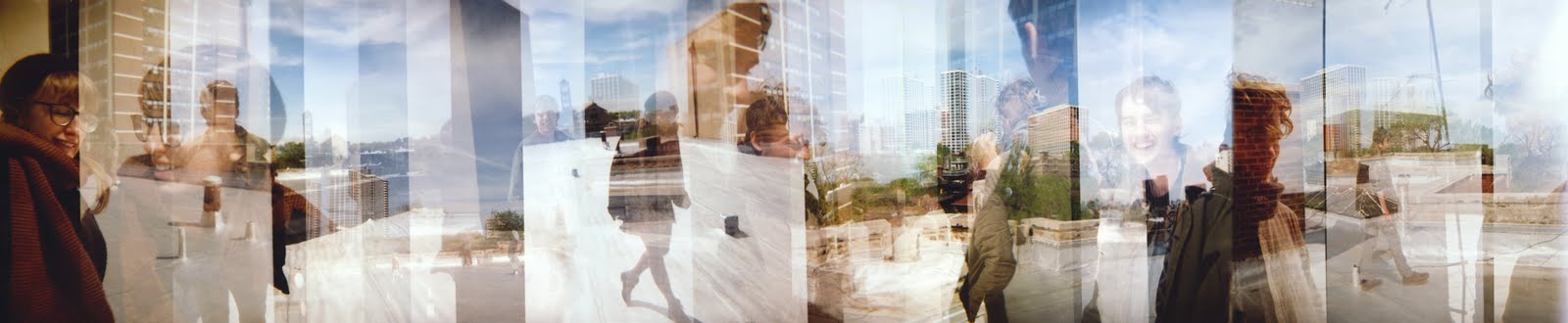
To take the cake, as they say: Ross, Sara, Bowen and I on the roof. There are plenty of beautiful things to identify here. Primarily, I'm a fan of the way the two-point perspective of the buildings in the landscape combine with the vertical breaks in differing exposures to create a really confusing medley of dimensions. Also, everybody looks so happy.

7.17.2011

Brain Frame


I am organizing a comix reading event at the end of this month. There will be slideshows, soundtracks, and a spaceship. I am reading along with four dear friends.

BRAIN FRAME: A PERFORMATIVE COMIX READING
THURSDAY, JULY 28TH, 8PM
AT THE GALLERY FORMERLY KNOWN AS HAPPY DOG
1542 N MILWAUKEE AVE, 2ND FLOOR

Sara Drake
Lyra Hill
Nick Jackson
Ian McDuffie
Otto Splotch

Otto and I drew this flier this weekend, and printed it using color copier color separation. We brainstormed (pun intended) the image and then took turns drawing it, first penciling and then inking. I'm totally flattered that you can't tell it was drawn by two people, because I think Otto is so good at comics. It's also great that Nick let us put his number on the flier, because he doesn't have a website for us to link to.

•••

My friend Sara Drake, who will also be reading at Brain Frame, is currently trying to raise money to travel to Cambodia this fall, and teach comics to young women. Sara is a dedicated, intelligent, warm and talented person and is the best candidate I know for this job. Please help her out:


•••

Josh Mabe and Jason Halprin, more friends, are also preparing an important, exciting venture: Chicago 8: A Small Gauge Film Festival. I'm planning on submitting to this festival along with several fantastic filmmakers I know. Josh and Jason are talented, tasteful individuals and master film technicians. Help initiate a hopefully annual cultural event:

7.08.2011

Matchbook Business Cards


Back in offset printing class (these entries are just a post-graduation clearing house, aren't they?) I had some space left on the side of a print, so I thought I might as well make the most of it.

I had been wanting to make some business cards for myself. Predictably, the thought of just making regular business cards never occurred to me. Instead, I got excited about the possibilities of matchbooks.


I liked the thought of matchbooks with real matches in them. Because I didn't have the capacity to offset print that sandpaper strip that helps you light the paper matches in regular matchbooks, I had to use strike anywhere matches. For this version, I created a design with a stove on the front and a campfire on the back (two ways you can use the contents!) and 'STRIKE ANYWHERE' printed on the spine.

The reason I was able to fit these two pattens on the scrap edge of a larger print is because I made them very narrow (and, by virtue of the mechanics of matchbooks, the unfolded print is also very long). They are narrower than regular matchbooks, being 1" wide as opposed to the more standard 1.5".

The second pattern pushes the boundaries of matchbooks even further. I thought long and hard, trying to come up with another small, thin, disposable object that would be useful and pleasant to dispense in small portable batches. Toothpicks!


This toothpickbook unfolds to show a stretched out, weird face. The upper lip tucks into a reproduction of itself. The toothpicks are lightly glued to each other and then stapled inside, and easy enough to pull out one at a time (like the matches in the previous design).


I know they're decadent for business cards, but I'm also immensely pleased with them as mini art objects. The informative part of the card is stamped on the inside of the front flap. This stamp is one of those design-it-yourself types that come with lots of little rubber letters and symbols which you can then arrange to your liking. They're easy to buy at Staples or Office Depot, and not too expensive.

7.03.2011

Stepped Exposures


Last summer Andrew and I drove across the southern United States to move him to Los Angeles. I brought my Holga, which is broken more than Holgas are usually broken (primarily, the flash doesn't work, but other things are wrong too). I really appreciate my Holga for this reason. It's not a reflex camera, which means my framing will always be inexact at best. There's no way to tell if the light will be right, and the process of scrolling to the next spot in your negative can be completely arbitrary.

This is what I explored briefly during that road trip. The two exposures above are of my father and my grandfather walking the goats, and the one below is of Andrew at the Grand Canyon. It's the best one.

6.29.2011

Clam Shell Box


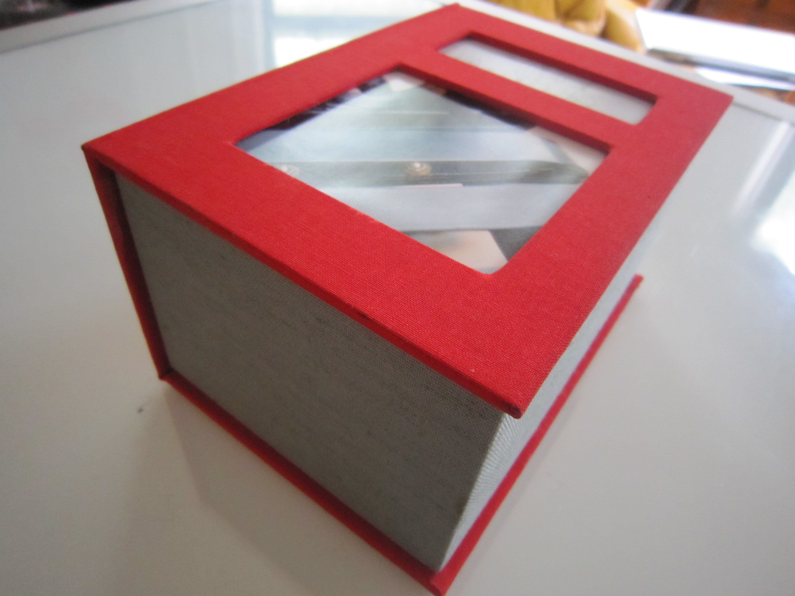
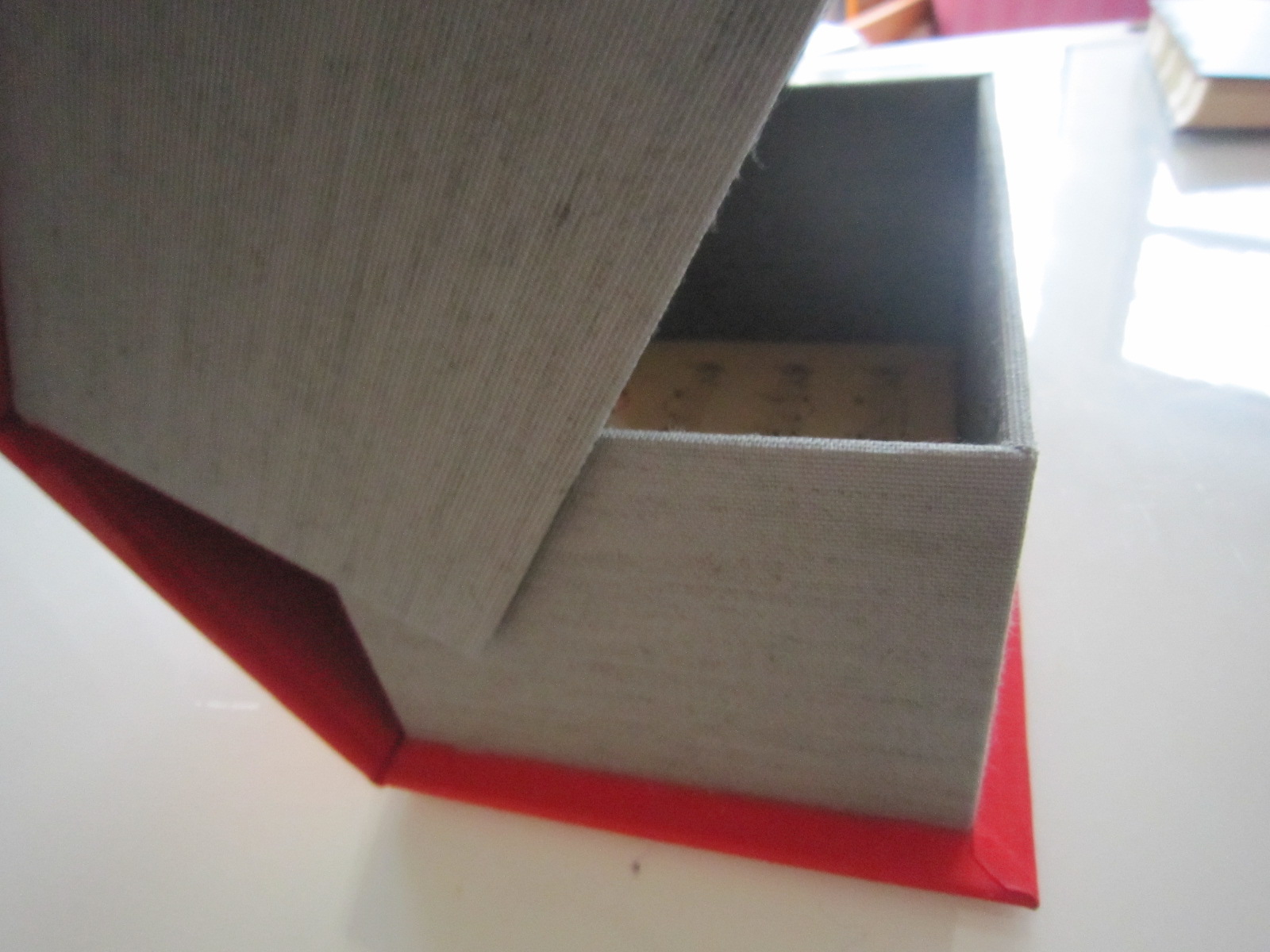
Here's another of my final projects from that artist's books class I took two years ago. This is called a 'clam shell box' because of the way it nestles together, and the broad flexible hinge. It's very similar to the hardback cover of a book with a flat spine, but instead of pages, there's more bookboard making up the sides of the box.


I wanted an interesting cover on the box, so I made two windows in the front bookboard panel, using them as frames for prints of old photographs. I was thinking about a refrigerator (no joke) when I mapped out the two photo-windows.


The rest of the box is made of more bookboard, covered in bookcloth and lined with found sheet music. The slot in the box's bottom wall is there so you can lift out its contents without turning the box upside down. I measured this box to fit the two hardbound books I had just made, but it is also the perfect size for 5x7 photographs, or drug paraphernalia or prophylactics, you know, whatever.

6.25.2011

Carbondale


These are old photos. They're from a camping trip I took with two friends, two years ago, in March of 2009, to southern Illinois, outside Carbondale.


You may remember this film, which was shot during the same trip. Here's Aj in action:


These are not all of the photographs, just ones that I think are particularly interesting. I take a lot of photos, but only because I'm on this vacation or that one, or someone is visiting, that kind of thing. I approach them as snapshots, which is a welcome relief from the lengthily and detailed planning that goes into most of the things I create. Photos are a way for me to document my life (like diary comics) without the pressure of premeditation or commitment, and any artistic merit that shows up when I get the prints back is an unexpected joy.

I like thinking about my photos in groups of three. Here are three closer examinations of the natural world:


And three pictures of Lale sitting on something far away:


And one picture that looks prehistoric:


This post has been short on discussion and analysis, so I'll throw in one more photograph that strikes me as particularly beautiful. I love the proxy-horizon-line here and how it tips you off the left side; the way that second rock is not quite strong enough to keep your eye in the image. And how the upper earth - the ground that is visible, somehow, on top of the mountains - is curved away from you like an exaggeration of the bow in the planet's crust. I find the perspective in this photograph discombobulating in the best, most breath-catching way. Aj's precarious position on the right side of the frame seems tenuous at best, and even he is leaning in to try and make some sense of the balance within the image. And, that rosy rust color of the leaves on the ground kills me.

6.21.2011

Round Spine, Flat Spine


Back in spring semester of 2009, I was in an artist's book class. Remember? These two books were the last editions I made, and the fanciest. They're real hardback books, with many signatures, stitched and bound traditionally and really nicely. The quality of these editions is something I'm very proud of. First, the round spine:


Both books' innards are 50% found paper (posters, wrapping paper, opalescent tissue) and 50% purchased paper. The paper I bought is soft and ribbed, good for sketching or writing. For the round spine book, I used this drawing paper, striped brown wrapping paper, tissue, and the remnants of an old water-stained poster for Guatemala.


And now, the flat spine:


This pages in this book are comprised of the same soft drawing paper and tissue, as well as found posters from the first Austin Powers movie, and The Jimi Hendrix Experience.


•••

OTHER NEWS:

This Friday, I'm participating the seventh installment of the EAR EATER reading series, previously curated by Cassandra Troyan and Sara Drake, and now curated just by Sara Drake (at least this time). Anyway, I'll be doing a performative reading of the prose version of the story of the Squishsacks, and it should be pretty exciting. I will be really nervous, come watch me try not to shake when I talk.

The other readers at the event are:
Halle Butler
Kristin Hayter
Nick Jackson
Anders Nilsen
and Sara Drake.

You should come. It's at 1622 S. Allport St. Apt. #1, commencing between 8-11pm, on Friday, June 24th.