10.28.2011

Go Down Part 2


Wuh-oh! What's happening here!?! This is the second part of Go Down, the comic I made for the first issue of Chromazoid, a comic anthology and mixtape that still needs help, so help us! These are pages 4 through 6. The end of this comic gets even crazier.

I really like how the panels in the 6th page are shaped like the crystals.

10.18.2011

Go Down / Chromazoid


So, what do you think about this special sneak preview of my newest comic? Do you like it? Does it pique your interest? Personally, I think this is the best work I've done to date, and twice as exciting - because it's in color. It's my first comic in color! (Well, not including these two, but let's not talk about embarrassing, ancient history.)

What's that you say? You'd like to know what comes next? Well, then why don't you consider donating to the Kickstarter campaign for CHROMAZOID, a brand new, full color, horror comic anthology put together by my dear friend Lale Westvind? Contributing a mere $25 earns you a signed copy of the book as well as two mini-comics and a mix tape! Give more, and you get even more cool stuff! There are nine artists featured in CHROMAZOID, including yours truly and a gang of other criminally talented fresh meats.


Seriously, this is an incredible project and I would really love it to get off the ground. If our first issue is successful, this will become a truly great series of compilations, full of art by people who really, really deserve to have their work seen and distributed. Don't you want to be able to say, years down the line, that you helped the first ever issue of CHROMAZOID hit the stands? I guarantee it will get you laid at that future party.

About the comic: Because I had to work in color for this project, I wanted that trait to be important to the story, and a definitive part of the world I'd be drawing. I've been thinking about crystals a lot recently. (When I told Otto this, he said "Oh, good, you're getting back to your roots.") An image of a multifaceted, ever-changing crystal in anaglyphic red and cyan keeps appearing to me, and so it became the catalyst in this story. I colored the rest of the comic with ink wash pencils, leaving blank space for the crystal. I made overlays with tracing paper on each page, using a pen and ruler to outline the crystal and its facets. After scanning each page and its overlay, I filled the facets with flat computer color, artificially misregistering the red and cyan layers (and setting them to 'multipy,' so they would combine as if they were printed pigments) to create the illusion of offset printing and three-dimensionality (not to mention otherworldliness). I left the crystal's outlines blank to emphasize its unique properties and make it seem even more out of context with the rest of the comic.

A lot more happens in Go Down (it's eight pages total). Please consider donating! I'm very excited about this work and I want everyone to read it.

10.13.2011

Pizzaccoutrement


I work at a pizza place. Whenever I work anywhere, I get asked to draw the signs. That's me with the new chalkboard we got at work (no one else is allowed to draw on the chalkboard now, according to my boss).

Whenever it's slow my mind goes hyperactive and I have to occupy myself. I could get a lot of work done, in this time, except I'm not usually allowed to sit down. This uncomfortable limbo yields a lot of quick sketches on Guest Checks.


Halloween is also a very special time of year for me. I love making Halloween costumes. This year, if I get my idea together in time (I'm going to be a shaman priest slaughtering a goat) it'll be awesome. Halloween, or Samhein, is also... THE WITCHES' NEW YEAR!! which is really exciting.

This is what happens when I get into the spirit while I'm bored at work:


The pictures above are ordered in the sequence I drew the pumpkin. I think each consecutive one is better. I used a Sharpie (actually several).

And, of course, more chalk. These two drawings are on either side of the sandwich board right now. Spot this sign in Chicago; you'll find me inside! I won't give you free pizza.


9.09.2011

Brain Frame 2


It is happening again.

At The Gallery Formerly Known As Happy Dog, that being located at 1542 N Milwaukee Ave, 2nd Floor, occurring on Thursday, September 22nd at 8 PM.

Reading:
Ben Bertin
Edie Fake
Robin Hustle
Mike Lopez
and me, duh.


The three-color at the top is the big poster - the grid above is all the smaller, two-color fliers. I drew the outlines for this poster while I was visiting Detroit, sitting in bars, hanging out with these guys. You can read it upside down too! See the '2' hidden in the image? Psychedelic. Can you guess how these were made?

Oh, and: brainframe.tumblr.com

8.26.2011

Join Me On This New Vision Quest


So  Brain Frame #1 was a huge success. Somewhere in the area of forty people attended, each and every performer blew the audience away, the event was met with resounding enthusiasm. It makes sense, then, that I've decided to continue Brain Frame as a bimonthly reading series.

Look, so legit: a website.

And here's a sneak behind-the-scenes peek of some moments between me and Nick Jackson reading. I'll have videos of some of the readings up on the Brain Frame site too.


Brain Frame #1 (behind the scenes) from Lyra Hill on Vimeo.

The next Brain Frame will be at 8pm, Thursday, September 22nd, at Happy Dog Gallery, 1542 N Milwaukee, 2nd floor. Stay tuned for a sweet poster.

7.28.2011

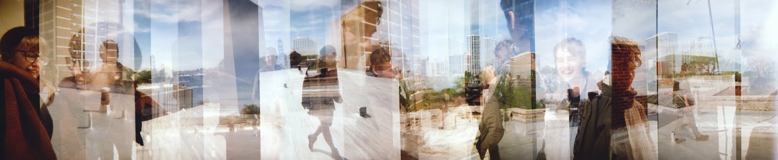
More Stepped Exposures


More of this. You should really look at these up close. The image above is from Ventura, CA. Accidentally, the compositions here do wonderful things: look at the shape of the dock across the photograph. That lone surfer kills me. Those are our shadows waving at the beach.


These two are from inside my apartment. That's my brother's silhouette in the second set. Nice colors, yeah?


To take the cake, as they say: Ross, Sara, Bowen and I on the roof. There are plenty of beautiful things to identify here. Primarily, I'm a fan of the way the two-point perspective of the buildings in the landscape combine with the vertical breaks in differing exposures to create a really confusing medley of dimensions. Also, everybody looks so happy.

7.17.2011

Brain Frame


I am organizing a comix reading event at the end of this month. There will be slideshows, soundtracks, and a spaceship. I am reading along with four dear friends.

BRAIN FRAME: A PERFORMATIVE COMIX READING
THURSDAY, JULY 28TH, 8PM
AT THE GALLERY FORMERLY KNOWN AS HAPPY DOG
1542 N MILWAUKEE AVE, 2ND FLOOR

Sara Drake
Lyra Hill
Nick Jackson
Ian McDuffie
Otto Splotch

Otto and I drew this flier this weekend, and printed it using color copier color separation. We brainstormed (pun intended) the image and then took turns drawing it, first penciling and then inking. I'm totally flattered that you can't tell it was drawn by two people, because I think Otto is so good at comics. It's also great that Nick let us put his number on the flier, because he doesn't have a website for us to link to.

•••

My friend Sara Drake, who will also be reading at Brain Frame, is currently trying to raise money to travel to Cambodia this fall, and teach comics to young women. Sara is a dedicated, intelligent, warm and talented person and is the best candidate I know for this job. Please help her out:


•••

Josh Mabe and Jason Halprin, more friends, are also preparing an important, exciting venture: Chicago 8: A Small Gauge Film Festival. I'm planning on submitting to this festival along with several fantastic filmmakers I know. Josh and Jason are talented, tasteful individuals and master film technicians. Help initiate a hopefully annual cultural event:

7.08.2011

Matchbook Business Cards


Back in offset printing class (these entries are just a post-graduation clearing house, aren't they?) I had some space left on the side of a print, so I thought I might as well make the most of it.

I had been wanting to make some business cards for myself. Predictably, the thought of just making regular business cards never occurred to me. Instead, I got excited about the possibilities of matchbooks.


I liked the thought of matchbooks with real matches in them. Because I didn't have the capacity to offset print that sandpaper strip that helps you light the paper matches in regular matchbooks, I had to use strike anywhere matches. For this version, I created a design with a stove on the front and a campfire on the back (two ways you can use the contents!) and 'STRIKE ANYWHERE' printed on the spine.

The reason I was able to fit these two pattens on the scrap edge of a larger print is because I made them very narrow (and, by virtue of the mechanics of matchbooks, the unfolded print is also very long). They are narrower than regular matchbooks, being 1" wide as opposed to the more standard 1.5".

The second pattern pushes the boundaries of matchbooks even further. I thought long and hard, trying to come up with another small, thin, disposable object that would be useful and pleasant to dispense in small portable batches. Toothpicks!


This toothpickbook unfolds to show a stretched out, weird face. The upper lip tucks into a reproduction of itself. The toothpicks are lightly glued to each other and then stapled inside, and easy enough to pull out one at a time (like the matches in the previous design).


I know they're decadent for business cards, but I'm also immensely pleased with them as mini art objects. The informative part of the card is stamped on the inside of the front flap. This stamp is one of those design-it-yourself types that come with lots of little rubber letters and symbols which you can then arrange to your liking. They're easy to buy at Staples or Office Depot, and not too expensive.

7.03.2011

Stepped Exposures


Last summer Andrew and I drove across the southern United States to move him to Los Angeles. I brought my Holga, which is broken more than Holgas are usually broken (primarily, the flash doesn't work, but other things are wrong too). I really appreciate my Holga for this reason. It's not a reflex camera, which means my framing will always be inexact at best. There's no way to tell if the light will be right, and the process of scrolling to the next spot in your negative can be completely arbitrary.

This is what I explored briefly during that road trip. The two exposures above are of my father and my grandfather walking the goats, and the one below is of Andrew at the Grand Canyon. It's the best one.