1.30.2009

Sherrif Cat

A year ago, in my Video 1 class, my friend Nick Edelberg and I used to pass notes constantly, when we weren't commenting insightfully on our classmate's work. A couple times we passed comic games back and forth: for example, I would draw the panels and empty word balloons of a short comic strip, and he would fill in the text, and vice versa. Thus, Sherrif Cat was born.


I really liked Sherrif Cat as a character, the kind of asshole lawmaker who doesn't actually uphold the law, rather uses it for his own benefit. We also decided that Sherrif Cat must end every strip he's in by saying 'True Dat'. (Get it? Sherrif Cat says True Dat!) Here he is in a very, very nerdy comic, Sherrif Cat Fights For Truth In: The Fibb-a-Nazi Sequence! (See, it's a play on the Fibonacci Sequence, but about lying Nazis making math puns.)


Sadly, the original Sherrif Cat drawings have been lost, due to my sketchbook falling out of my bag while biking. People, I write my name and number in all my sketchbooks, but of the three I've lost, I've been returned zero. Losing a sketchbook is worse than losing your wallet, keys, and phone at the same time. If you ever find anyone's sketchbook, please return it to them.

P.S. I know 'sherrif' is actually spelled 'sheriff'. There's another comic about that where Sherrif cat is playing Guitar Hero.

1.28.2009

Scroll


In the spring of 2007, in my Intro to Fibers class, I conducted my first experiment in beading in approximation of organic material.


I can't clearly remember, but I think that the only guidelines for our first assignment was that we had to bead or embroider something, and also incorporate felt. I never got around to the felt part, because beading an entire scroll takes a really, really long time.


To start, I took a 22'' x 30'' sheet of thick soft etching paper, roughly scored and tore it into strips about 3'' in width, painted in watercolor pale yellow lines down the length of the strips, laid them out on a wooden board, soaked them with water from my kitchen sink, and began scraping and hacking at the non-watercolored side of each strip until they had been satisfactorily decimated. I then stitched together the ends of each strip with a zippered blanket stitch, as well as sutured the most gruesome of my inflicted wounds.


After drying, I then attached old chopsticks I had covered in fabric to either end of the scroll, and began the decorative/decaying process of beading around the stitches and open holes in the paper.


I started at the left end and worked my way to the right, progressively darkening the color of the beads I was using, from whites, silvers, and yellow, through oranges and reds, and then to purple and black. I also increased the amount of beading, the spread of the mold.


The stitches that healed the paper were white, but the thread which bound the beads was gold. On the opposite side of the paper, you can see all of the stitching, and when the scroll is wound, the layers of beading and thread peek out.


I was thinking a lot about religion and spirituality that semester (as usual). I was interested in the boundaries between artificial and natural, and organic and inorganic, and the place that human religion and language take within those differences. What does it mean for us to worship documents created by our ancestors, and how does that practice compare to the worship of the natural world? When it is understood that all Bibles will eventually rot and turn to dust, all Torahs eaten by worms, and all our Qur'ans mold and disintegrate, what then is the highest power? As a species so inspired by beauty, we represent the holy in gold leaf and complex geometry; is there a better way? All of our most sacred documents are reproduced and represented in text. I find this to be limiting and unnessecary.

For class, I first suspended this piece, unfurled, in front of a light source, and then took it down to be laid on a long table. When light shows through the paper a completely new texture is revealed. You can see the ravaged fibers and the beads stand out like dark growths around the sutures and gaping holes.


1.26.2009

Buttons


Here are some more buttons that were up for sale at the Holiday Art Faire. I use this rainbow fabric to make buttons a lot, because it's soft and fuzzy. There were a couple little kids totally entranced by these buttons.


1.23.2009

On Holiday


These are my (artsy fartsy) favorites from a couple rolls of film I shot over the Thanksgiving holiday, in Chicago, and the winter break, in Bodega Bay. That's my little sister Jojo up above, after the first snow after Thanksgiving. Here she is running through a tunnel:


The film was daylight balanced, which is why everything under the florescents appears green, and everything inside (tungsten lighting) appears red:


(That's my kitchen!)

In Bodega Bay, where my mother lives, Jojo and our dad and I all took a walk to the tidepools on Jojo's birthday. Bodega Bay is stunning and it was a perfect day for photography, with overcast skies and lots of soft, cold, diffused light.


I was conciously playing with a couple of things in framing these shots, most notably the horion line - look at the angle of the sky in all three of the above pictures, descending from right to left at the very top of the frame. The sweep of the landscape in all of these is striking. Look at the barely noticeable black trees in the top right corner of the second photograph, and the tiny corner of incoming wave in the top right corner of the third photograph.

The colors of the landscape also struck me as particularly riotus. I was really happy how the development of the photos captured this insane green:


It also helped that I was using my grandfather's old camera, an old heavy Topcon, that vignettes the image a little bit. You can see it more clearly in this photo:


See how the corners are darker? That picture above is actually my favorite of all the photos in the batch. I remember standing there framing the shot (again, playing with the horizon - the sky takes up nine tenths of that photo) waiting for the perfect wave to stretch right across the frame. I was so happy when I saw this come out. Look at that subtlety of color gradation in the sky and the sea! Look at the palpable sense of serenity! Gosh!

The other amazing thing about that day were the rocks. The tide was very, very low so we were able to see all kinds of starfish and anemones and lichen and barnacles and shellfish:


Texturally incredible. You can really see the vignetting of the color and also the focus in that picture of the starfish. I love things that are gross and beautiful the most.

Of course the very most beautiful things there were Jojo and Ross:


I can't help staring at their eyes for at least a minute every time I look at this picture. And for a bonus, the one shot Jojo took for me, with really creepy Tungsten coloring and incredibly eerie execution:


I'm watching you.

1.21.2009

Wonder Woman


This is my most recent Halloween costume (which I am wearing in this comic). I sewed the entire thing from tapestry and velour pieces I culled from my giant collection of old fabric and scraps.


I was looking primarily at one specific poster I have hanging on my wall, and while the tones of the fabric I chose are definitely more earthy, I like to think I got the pattern pretty close (minus the stars on the shorts and the head of the eagle).


I also added some beadwork to the headband, cause once you're on that crafty road, you can't really turn off and head down a different route.


I built the pattern around a corset I have (which is also what I relied on to support the costume underneath) and built the shorts around myself. It was an intensive trial and error process, and I only finished at midnight on Halloween, but it was totally worth it.

1.19.2009

The Pegasus


A drawing from my comics sketchbook that was completed across several months, due to hatred for stippling. Below is an earlier scan of it, you can see the line work more clearly.


(Happy MLK day!)

1.16.2009

Button


Another button out of recycled fabric and buttons and things. I made this one towards the end of the Holiday Art Fair last November; I had produced a bunch more but unfortunately did not get to photograph them before I (fortunately) sold them. This one I probably set out in the last hour of the fair, and that's probably why it's still around. I will be making many more of these guys and selling them at Pantheacon next month.

1.14.2009

Copulate


Another zine. Above are the middle three spreads; if you can't tell, the dots that the ear monster begins to emit join up with the smokey goo stuff the big faces ooze, filling in their centers. This is where the title 'Copulate' comes from. This is my favorite zine I've done so far, and I'm planning on turning it into a larger format screenprinted artist's book type thing, on nice paper, with different colors. Below is the front and back of the zine.


And if you'd like to make your own, here is the full pdf.

1.12.2009

The Dreadful


Last summer, in my Comics/Narrative/Material class, we were assigned to create an edition of something, using source material as an influence. I was also in the class 'Madness' at the time, and very interested by R.D. Laing. So I started looking through his work for a passage that struck me, and found this one in 'The Politics of Experience' from 1967, on pages 54-54:

Behavior can conceal or disclose experience. I devoted a book, The Divided Self, to describing some versions of the split between experience and behavior. And both experience and behavior are themselves fragmented in myriad different ways. This is so even when enormous efforts are made to apply a veneer of consistency over the cracks.
I suggest the reason for this confusion lies in the meaning of Heidegger's phrase, the Dreadful has already happened.
Psychotherapists are specialists in human relations. But the Dreadful has already happened. It has happened to us all. The therapists, too, are in a world in which the inner is already split from the outer. The inner does not become outer, and the outer become inner, just by the rediscovery of the "inner" world. That is only the beginning. As a whole, we are a generation of men so estranged from the inner world that many are arguing that it does not exist; and that even if it does exist, it does not matter. Even if it has some significance, it is not the hard stuff of science, and if it is not, then let's make it hard. Let it be measured and counted. Quantify the heart's agony and ecstasy in a world in which, when the inner world is first discovered, we are liable to find ourselves bereft and derelict. For without the inner the outer loses its meaning, and without the outer the inner loses its substance.
We must know about relations and communications. But these disturbed and disturbing patterns of communication reflect the disarray of personal worlds of experience whose repression, denial, splitting, introjection, projection, etc. -- whose general desecration and profanation -- our civilization is based upon.
When our personal worlds are rediscovered and allowed to reconstitute themselves, we first discover a shambles. Bodies half-dead; genitals dissociated from heart; heart severed from head; head dissociated from genitals. Without inner unity, with just enough sense of continuity to clutch at identity -- the current idolatry. Torn -- body, mind and spirit -- by inner contradictions, pulled in different directions. Man cut off from his own mind, cut off equally from his own body -- a half-crazed creature in a mad world.


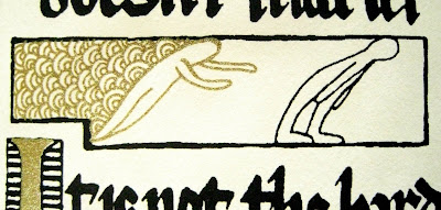
I started thinking about how to translate this into a form from which editions could be made, and what kind of style I would do it in. Because much of Laing's work focused on schizophrenia with what I felt to be a somewhat spiritual approach, I considered the encasement of this quote in a kind of religious document. I've always been fascinated with the ceremony and absolute devotion to beauty found in many religious trappings and tradition. Specifically, the ridiculous ornateness of the oldest monotheistic religions. So I checked out a bunch of books on illuminated manuscripts and began studying the calligraphy and organization of different pages.


I decided to edit the passage from Laing's book and create an edition of miniature hardbound illuminated manuscripts. I created my own kind of calligraphy based off of the Latin I found in the old books, adapting it to my needs, and borrowing from a wide variety of texts the layout and decorative ideas for much of my own work.


Illuminated manuscripts are decorated with myriad religious figures, angels, kings and the like. I considered for a long time the kinds of characters I wanted to inhabit my manuscript, eventually deciding, since the story was something of a blanket grieviance about all mankind, to draw my people featureless and indistinguishable from one another. Most important was the title page, and developing an initial, excessively decorative letter for the first word, like those found in old storybooks and (duh) illuminated manuscripts.


A side effect of this decision which I did not anticipate was that now I have to tell a lot of people, "it's the Dreadful, not the Readful".


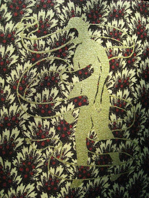
The entire book is a two-color screenprint from hand drawings, on really nice, soft, thick paper in black and gold. I took my favorite image from inside the book and screenprinted it in gold on the cloth I used for the cover. Each book is handbound with archival-quality thread and glue, and carboard weight covers.


This was an insane amount of work. It was worth it, though. Each book feels as rich as it looks, from the quality of the fabric, ink, and paper, to the slowness with which it is necessary to read it, to understand the calligraphy. One of my favorite things I've done in a long time.