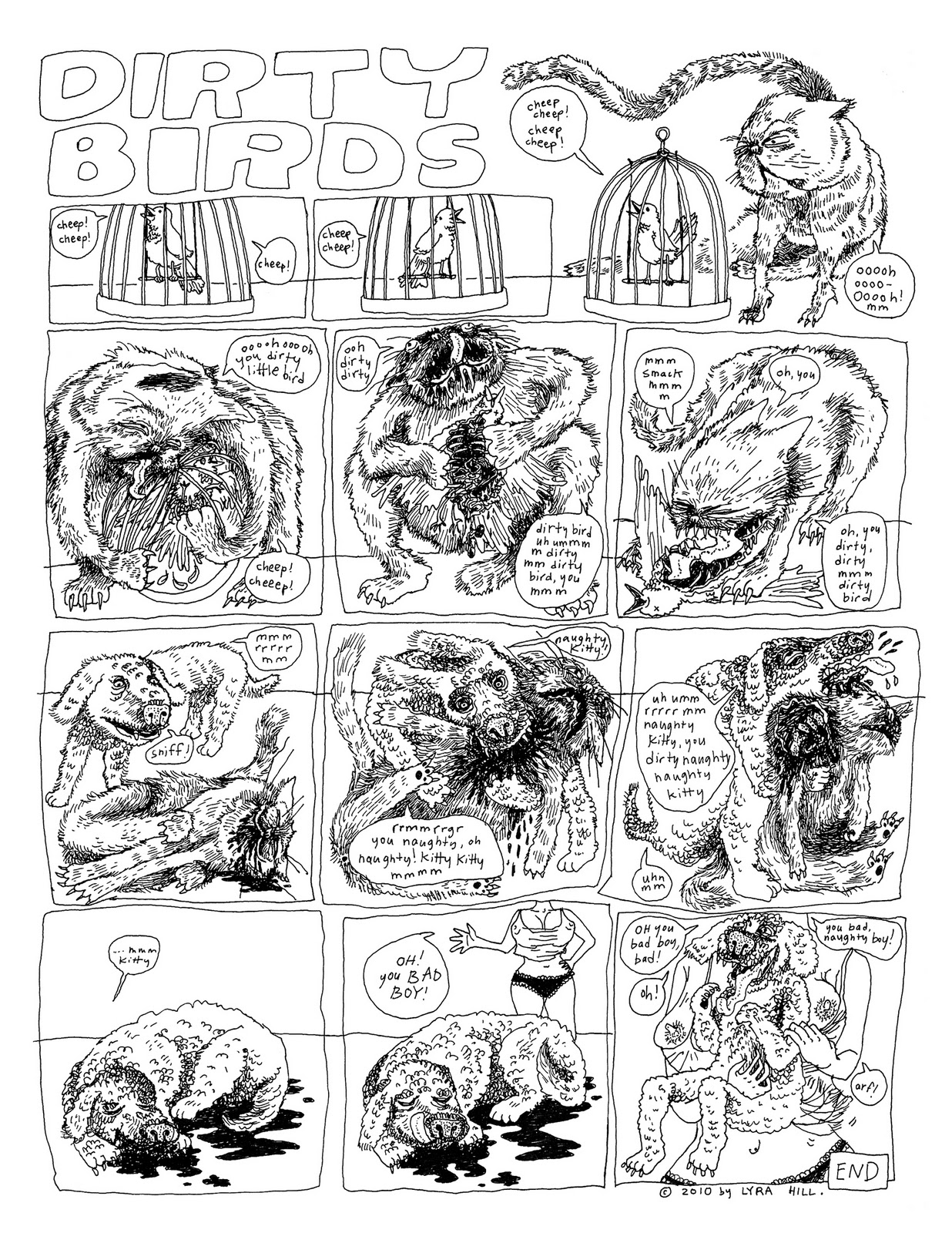
I drew this a while ago. Last fall (2009) in Offset class I made some posters. It's a three color print, blue, green, and black. I particularly like how the blue mis-registers with the green in the vomit. It adds dimension.
They're really nice, around 14x17 inches, and on thick, sturdy paper - 'desert sand,' it's called, and is the same paper these were printed on.
Andrew's little brother Justin wanted me to draw a fancy portrait of him with his dog, Lieutenant Gibson. I finished this in the late summer, and last Saturday we all went to Michael's and picked out a ridiculously fancy custom frame/matte combo. I hope Justin trains a light on it once he hangs it above a fireplace somewhere. Or surrounds it with candles. Something like that.
These mini-comics tell the story of Dock Ellis, famous for many things, but mostly for pitching a no-hitter on LSD. He has been immortalized before. This was my attempt.
That wide panel is a splash page in the middle of the book. This comic was made last semester in Surabhi Ghosh's class. The assignment was to write a historical comic.
There is no title to this comic. The covers are made of Thai marbled paper and colored rice paper. There's a window cut out of both covers, creating a frame around the lines, "She said, 'What's wrong with you?' He said, 'I'm high as a Georgia pine.'" It's a nice effect because the color of the rice paper matches some of the swirls in the marbled paper, and the look like they blend together a little bit; the rice paper is also slightly transparent, so after you turn the first cover page, you can see the shadows of emergent words.
We're putting out our first issue for the year next week. This is my submission. I've placed it on the page opposite my friend Nick Jackson's first comic, which is breathtaking, and so I feel pretty lucky about that.
In other news, Pop Serial just made its deadline for funding! Thanks very much, everyone who helped pledge and support. There will be a reading for the coming release (haha coming release) of issue #2 on Friday, November 19th at 8:00 PM at 1622 South Allport St. Apt. #1, which is Sara Drake and Cassandra Troyan's apartment. Sara and I, as well as Ben Bertin and Ingrid Olson, will have artwork up at the reading. So stop by, if you're in town.
It must have been a year since I made this run of high-class mini-zines. In my offset printing class, fall 2009, our first assignment was to make a one-color one-off project. I decided to use the opportunity to create a terrible Christmas card.
The last page shows me (this is a true story, about me!) sitting at a table with a bowl of lumpy something, stitches all over my face, eating through a large straw. One word bubble emanating from off-page asks, "is that straw big enough for you, sweetie?" while another, crossing tails with the first, says, "pass the turkey, please." At the bottom of the page is a large message: MERRY CHRISTMAS 2009.
As you can tell if you read the book, this is about the bike accident I had right before Christmas when I was eight years old. I skidded down a hill on my face and it really messed me up and totally ruined the holiday. There's still a chip of cement embedded in my nose. Gruesome closeup:
(Admittedly, slightly hyperbolic. Slightly.) I distributed this along with regular gifts to my friends and fellows last year. Because it was an offset project, I had to do a large run of prints, so I still have about 60ish copies left. I'm thinking of covering up the 2009 part and just giving them out as sick jokes, or selling them as sick jokes for other people to give out.
HEY GUYS, HEY! My friend Stephen Dierks, a poet and writer and small-press publisher, is trying to make the second issue of his art/literature print magazine, Pop Serial, happen. He has the ambitious and wonderful idea to publish Pop Serial #2 as a perfect bound edition, because, in his own words: "I like visually appealing art objects, and hopefully you do, too. Also, I want the magazine to be more durable and nicer to hold and turn its pages." Amen. Stephen has initiated a Kickstarter fund-raising project to make this happen. If you pledge $10 to the perfect-bound cause, you are guaranteed a copy of the magazine, and if you pledge more, then you may receive a variety of additional printed prizes.
Lots of wonderful artists and writers will be in this edition, including yours truly. Now is your chance to own the first officially printed and published copy of any of my work, ever. Jump on it. Also, help a brother out.
Back in April (around the 26th, to be exact) Andrew had a birthday and I made him a birthday cake at his parent's house in Grand Rapids. Andrew likes dinosaurs.
It was supposed to be a surprise but then the time spent making the dinos became too long of a period to exile Andrew from the kitchen. They're built around tin foil armatures, covered in butter frosting mixed with food dye. Andrew's cousin Donny helped decide on the right prehistoric skin/scale tones.
The blood is made from that colored gel stuff you can buy at the cake-decorating section in any big grocery store. The nails and eyes and stripes are black gel stuff, applied with a toothpick. In some pictures you can really see the dynamic, violent action and exquisite pain in the face of the green dinosaur. You really feel the cake.
I got the candles at that fancy-ass pastry counter at Whole Foods. And the cut up strawberries are supposed to be exotic plants.
It is a chocolate beet cake with cream cheese frosting, and gluten-free for my crippled celiac self.
What have I been doing? I hear maybe one, maybe no one ask. Well, here's the answer: I've been planning for bigger and better things! I've been working on finishing not one, not two, but three films! I've been reorganizing my house! I've been reading a lot of feminist literary theory. This has been the main activity. And also... I've become Co-President of the Experimental Film Society!
Ross, Randy and I have organized a tight schedule of screenings and meetings throughout the semester. Every alternate Monday we're screening an hour-long series of 16mm experimental films, and the Mondays between those we're meeting with fellow students for workshops on shooting, hand-processing, and other ways of manipulating the materiality of moving pictures. One of the tasks that I have volunteered for specifically is creating fliers and posters for each of these events. Observe:
I'm attempting, with the fliers for the workshops, to project the absolute friendliest face possible. I think the cheesy wording and pictures of kids having so much fun is really funny in an approachable way, which is constructive considering the reputation for purist elitism that haunts the tired argument between film and video.
With these posters, I'm exploring different styles purely for my own interest and pleasure, with the consistent thread of camera/projector-headed figures. I'm not actually a fan of the Are You Experienced poster - the design ended up muddled and confusing, with too much black and too much in general. While there are good things about it - I really like that font I made up in the lower right corner - on the whole I wished I had turned it out completely differently. The second poser was an effort towards lightness and legibility, without losing any of the interest.
Remember this? The footage I shot at the zoo, which I then created several HiCon mattes of, isolating the blacks, whites, and greys? Well, after my experiments recreating the image from the original negative as well as different textural stand-ins, I decided to move on to recreating it with different colors filling in for each gradation. The images you see above are two of the very few successful frames resulting from this attempt. Again using the Oxberry OP, I photographed each gradation separation matte in conjunction with a mock orange mask and various color filters, transitioning between colors with cross-dissolves, three times onto 3383 color print stock. Had I not overexposed everything, (or, really, underexposed by overlighting) I would have ended up with an awesome version of the same footage where each restricted gradient of zoo footage gently oscillated between random colors in beautiful psychedelic tandem.
Before I attempted the above experiment, however, I did fuck around with some other techniques, namely bipacking the original negative with the gradation separation mattes and a fake orange mask and cross-dissolving color filters. Probably because of the extra film strip (the negative), this attempt was (kind of) properly exposed and turned out some beautiful results.
This video begins with a straight up positive print of the footage, which I included to see how my orange mask was working out. I underestimated the amount of orange I needed, which is why everything looks sepia-toned. This becomes irrelevant as soon as the multiple exposure (due to cross-dissolving) kicks in - as soon as the ducks come out you can see me switching around the color filters. I had not yet added the gradation separation mattes, and at this point it's still a straightforward, though colorful, positive print.
Of course, none of it looks straightforward at all, because the film is out of focus and the frames are jumping all over the place. This is because I made the amateur mistake of forgetting to close the gate in the camera, so the print stock was sliding all over the place. I remember being confused because the frame count kept getting out of whack on the camera and the projector, and now I know why, and what to do if it happens again. In these still frames you can see how I intended the cross-dissolve colors to combine, and how they look when they're separated by misregistration:
I also love it when all of a sudden there's a frame that found its place in the gate, and managed to be in focus:
Ultimately, in this instance I'm happy I forgot to close the gate, because it gets really cool when the zebra comes in. At this point in shooting the print I locked into one frame of the negative, and began combining it with its black/grey/white mattes. I exposed each separating matte with the still frame and plenty of cross-dissolving color filters, rewinding the film each time to shoot the next separation. In the end I had exposed the same strip of print stock about six times, accounting for each gradation and the cross-dissolves included in each of those runs. Of course, I didn't know my film was helter skelter inside the camera. Here are some nice stills of that crazy shit:
At the end of the video the zebra image fades out and you start to see just the shape of the misregistered frame. I was continuing with the filters and dissolves, but because I took out the negative and the mattes I ended up over(under) exposing everything and all there is the shape and a slight glow from the changing filters.
Technically this project pretty much resulted in disaster, but I still love some of these images and the things I learned from my mistakes are incredibly valuble. Next up: intentional psychedelia and sci-fi themes. I'm done with zoo footage.