5.09.2011

Color Tests and Obligatory Self-Congratulation

You guys like color tests? Huh? Yeah?


Color tests are how you figure out what filters you need on an optical printer in order for your finished print to be the appropriate shade. These are a couple tests for two of the four films I'm currently finishing (you may recognize The Mystic and House Fuck.)

•••

OK SO IN OTHER NEWS, I uh, I'm graduating after this week, which means three things:
     1. The URL for this Blogspot will no longer be correct (currently it's I am an art student what am I doing, but I won't be an art student anymore! Should I change it to I was an art student? Or leave it, in anticipation of educational purgatory such as graduate and doctoral studies? Does it matter? The answer is no, ergo the URL (while factually inaccurate) will remain the same, no need to update your bookmarks.)
     2. OMG I'm going to be done with school what the hell
     3. I can't remember the third thing because I'm completely exhausted, up to my old shenanigans (see bottom of linked post) again.

ALSO GUESS WHAT
     4. I won the top prize SAIC Excellence in Student Leadership award, which is pretty cool. They're going to feature me on the SAIC website, and interview me for SAIC Student Association's new website as well.
     5. I am also the recipient of one of the SAIC BFA Fellowship Awards, which means I submitted a portfolio and artist's statement and resume and a bunch of important people who run prestigious schools and museums were like, "yeah, this girl is alright," and then they gave me a bunch of money. So I can actually fund the films I was planning to make this summer, now. Thanks SAIC!

I'M STILL SHOWIN' STUFF
     6. On Monday night, May 23rd, ExTV will be airing the second of two (identical) episodes of work by yours truly. It's playing on CANTV, Chicago's public access station (channel 21!) at 11pm. They wrote some nice things about me on the poster; I'm honored.
     7. This is not really an official event, but Ross and I will be showing several finished 16mm prints for our family and friends at 8pm on Friday, May 20th, in room 1307 of 112 S Michigan Ave. Anyone is welcome to come, just tell security that you're there for a screening and they'll let you up. Both Ross and my families will be there (it's the night before graduation) and it will also be the unofficial premier of a buttload of stuff I've been working on for years.

AND FINALLY
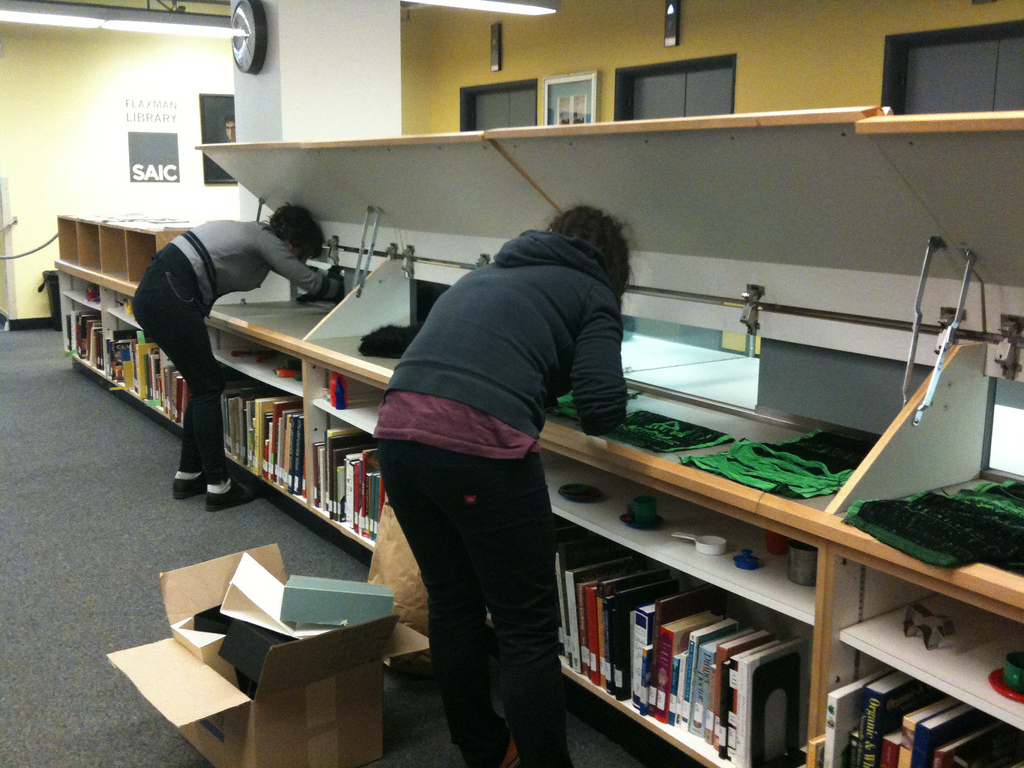
     8. Here are some pictures of me installing Llama Man and Night City in a glass case at the Flaxman library. The show was called Object Relations, and featured three artists (including myself) who work both in film/video and the physical realm. He lives!


4.28.2011

Film Frame


This event is past. Actually, all of the Experimental Film Society events (except one special one) for the spring semester have passed. I am relieved as well as saddened to be done with the constant barrage of minute, mundane tasks that were the running of EFS. (As well as larger, more interesting but similarly time and energy consuming tasks.)

This was a special screening for me. It wasn't the last screening, nor the second to last - those two spots were held by programs of work by Betzy Bromberg, an incredible filmmaker, teacher, and woman in general - but it was the last that I made a poster for. It was also the screening that I had the most to do with creatively. This was one of the few screenings Ross and I programmed that had more to do with a conceptual or stylistic idea as opposed to a convenient grouping of films we wanted to see. As such, it almost feels valid to say that I... curated... this screening.

Anyway, you don't care about that, you (ostensibly) care about the poster. Well, the poster is, you guessed it, more color copier color separation, this time using the technique to separate the different levels of frames-within-frames, avoiding overlapping colors and the combinations that result thereof. The only exciting about this specific instance was the color/frame layer made of two hands.

Most of the images that make up the poster were pulled from Google Image Search, but for the hands I used my MacBook's built in camera to take photos of my own hands. When blown up to 300dpi and 11x17 inches, however, the photos looked pretty shitty. So I printed them out at this size, then drew over them with a mechanical pencil to highlight the shading and creasing in the hands, as well as create a kind of faux-realist crisp resolution and increase visual interest. Then, I scanned the printout back in to the computer and composited it with the rest of the color/frame layers.

I know this story is not all that exciting, but I thought these photos of my hand over-drawing looked kind of nice. Enjoy.


4.24.2011

Bong Hits for Voting


So I'm in a class right now called "Sound and Image" and for the most part I've been finishing soundtracks for House Fuck and The Mysic (both of which have been edited/altered since I posted them here) as well as another movie I'm working on called My Sister At My Mother's House. In the meantime, though, I still have regular assignments.

One of those assignments was to ADR some footage. ADR stands for Automated Dialog Replacement, and it basically means dubbing over something. So that's my voice that you hear in the video above. Actually, every sound in the video above is me doing something (the original video had a Tool song playing the background; I chose not to recreate that). I picked the original video because Marijuana Man seemed like a nice guy and I like his videos. I hope he's not offended. Thanks, Marijuana Man!

4.16.2011

Are You Lonesome Tonight (Color)


Hey, remember this comic? I recently tabled the second annual Chicago Zine Fest, and I wanted Are You Lonesome Tonight? to be one of the comics available. (I also sold a considerable number of Dock Ellis comics, bike accident comics, and Motion Sickness posters.)

But, since I hadn't yet produced a nice run of Lonesome Tonight, I thought I'd add some color before doing so. Furthering my intimate relationship with color copier color separation, I experimented with paper towels, a pencil, and a light table to create textured, two-tone washes in the background of the comic.


The whole comic fits on two sides of one page (I drew it on an 8.5 x 11 sheet of paper, but printed this run on a 11 x 17 sheet). I wanted to have two overlaid, misregistered washes of color on each side of the original B&W sheet, so I had to color in four different paper towel overlays, two for each side. I laid the original sheet (not seen above) on the light table with a clean towel on top, and used a soft graphite pencil to color around the Elvis impersonators and their word bubbles. While I was drawing each two overlays for the same side, I didn't compare, preferring to create the shapes from memory, and contributing to the inexactness of the shaded areas once the overlays were combined. You can see in the second picture above that the drawings do not perfectly match.

The other advantage of drawing this way on paper towels was the texture from the quilted pattern.


After I finished shading the paper towels, I took them to the color copier and made a photocopy of each, setting the printer to 'single color.'


You can see how the texture of the graphite and the quilted towels made its way through the copying process, ending up looking a lot like crayon drawings.


Finally, I copied these differently colored overlays onto my original B&W photocopied pages of line drawings. I placed the blue and green layers together, and the red and magenta layers together as well. Because I couldn't decide whether I liked the combination of red and magenta or red and yellow better, I made half of the comics one way and half the other.


A lot of people at Zine Fest told me they were impressed with my crayon drawings. I didn't know it would turn out with that identifiable of a texture, but I think it's pretty cool and it works well with the weird, melancholy attitude of the comic.

3.22.2011

By and About: Jack Smith


Another day, another poster. Variations on a theme. The natural evolution of practicing printmaking on the color copiers. The next EFS event is a screening of four films, all starring Jack Smith - two by the man himself and one each by Ron Rice and Ken Jacobs, some of the other unknown Warhol Superstars.

Jack Smith is the most important underground filmmaker you've never heard of. Some quotes:
"The only artist I would ever copy" - Andy Warhol
"He was the king of the underground." George Kuchar
"The godfather of performance art." Laurie Anderson
"The only true underground filmmaker." John Waters

Come, if you're around.

In other news, my friend Francisco recently interviewed my other friend Matt O'Shaughnessy and myself on his radio show, GRINGO with Francisco Francisco. We talked about filmmaking, and what EFS does, and all kinds of other fun things. If you'd like to listen to the episode, go here. You can hear my dumb laugh a lot. The music is really loud in the beginning but it gets fixed, don't worry.

3.19.2011

Screenprinting: Christmas Presents


Ever since voluntarily (and happily) becoming unemployed in August of last year, I have been totally broke. But I still wanted to make some kick-ass Christmas presents. I've already written on one example. This is the story of me using all of the people I know in California to help me make two presents for Andrew.

I had a couple ideas. I wanted to make him a t-shirt using an image he had me draw last year, of a bunny holding a drumstick. At the time, he insisted that if he ever got a tattoo, it would be of a bunny holding a drumstick, and that I should draw it for him, just in case. Of course, he's never going to get a tattoo, but I knew he really liked the drawing and figured putting it on a shirt would ultimately be more useful.


I also know that Andrew really likes Carl Sagan, and thinks that the Gold Record project is incredible (which it is). So, since he had just moved and didn't yet have much large wall art, I decided to make a poster of the Gold Record as well. So, while I was in San Francisco, I stopped by Thrift Town, which I visit whenever I can because I miss getting all my shoes there, and picked out the biggest, goldest, most awesome frame I could find. The one I got came with a really cool print in it, a fine line drawing with watercolor washes of this monster scene of humans doing a wide variety of constructive and creative things, like building a boat or practicing ballet or attending the opera or sitting in an office. I went to Thrift Town just looking for a frame, but I ended up using this print as well. It was thematically appropriate.

Obviously screen printing was the best method for both of these projects. Screen printing is the best way to make t-shirts, and I didn't have the capabilities to have a large printer posted any other way (plus screen printing looks way better than some stupid laser printer or something). And, my best friend Zella's boyfriend Dewey has a screen printing-equipped studio in Sacramento. So I started by blowing up each design in Photoshop, then printing out sections on my mom's inkjet, then taping them together to reform the designs.


The Gold Record was more difficult than the bunny. Since the only image of the Gold Record is the relatively low resolution one on the NASA website, I had to do a lot of painful selecting on Photoshop to get a clean black and white stencil image large enough to print 22" in diameter.

Once I had the large images, I had to transfer them to acetate in order to burn the screens. For the bunny, this was easy; I wanted to end up with a simple line drawing, so all I had to do was trace my printout onto acetate with an opaque pen.


For the Gold Record, again, the process was more difficult. Because the positive area of the image was so large, it made no sense to color it with a pen. I considered making a cut-out stencil, but because there are islands areas (unconnected from the rest of the positive image) this wouldn't work either. Dewey ended up having some Rubylith, basically a clear acetate base with a thin red or amber emulsion coating. I'd never heard of it or used it before, but it's great. You can trace your image with an exacto and peel off the emulsion, but still have an intact singe sheet as a base. The emulsion is clear enough to see through, but the right color that it completely blocks the light on the light table when you burn a screen.


Once I'd finished cutting out the details on the Gold Record stencil, I cut the entire thing into a perfect circle. Then I gave Zella a haircut, and we tried to dye her hair with cooked and mashed beets, which didn't end up working out, but looked really gross and cool during the process.


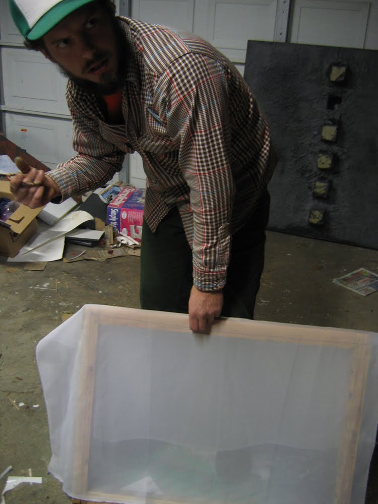
Before burning the screens, we had to stretch them (this part actually happened way at the beginning, before I made the stencils, but anyway). Dewey didn't have any screens as large as I wanted, so he very kindly made some frames and I bought some screen material and we proceeded to make our own.


After stretching the screens, Dewey coated them with emulsion. They took a really long time to set (during which I made the stencils). When they finally hardened (it was really cold and wet in Sacramento last December) we put them up on the light table and burned each screen.


I've only ever screen printed in the school studios before, so this whole process was pretty novel to me. I was incredibly impressed by Dewey's set up and the things he managed to do in a relatively small, not-fancy place. At school we have dry rooms with box fans and chilled emulsion and fancy tubs and sprayers and stuff. Dewey has a used light table and a garden hose, and he manages to accomplish the exact same thing (if it did take a little longer, being as we were at the mercy of the weather). This is a lesson I'm learning in regards to filmmaking as well, and a very useful one considering I'll be graduating in less than two months and won't have access to fancy school equipment after that.

After we burned the screens we sprayed them out and left them to dry.


Next came making the actual prints. We tested the bunny one quite a bit before actually printing the shirt I had picked up. There were some difficulties with the cleanliness of the image, but we managed to get out every bit of emulsion that wasn't supposed to be there, and cover up the places where it was supposed to be, but wasn't.


For the Gold Record print, we ran a couple on blank, dark blue paper before printing the actual image. We printed directly over the poster that had come with the frame I picked out. It had a wonderful effect: the gold ink is about %50 transparent, so it created this big glistening shape that is easily distinguishable from the complicated background, (and recognizable as the Gold Record, if you're familiar with it) but it's still possible to look up close and see the original image.


But the task was not finished! I drove Dewey and Zella back home, and then sped back to San Francisco to accompany my mother to a taping of Retro Night, a weekly show on KOFY TV, a local San Francisco television station. We hosted the It Takes a Thief episode.


After a similarly nostalgic meal, my mother left the city and my little sister Jojo and I went to stay at the house of a family friend family, Marian and Bob and their son Aidan, who helped Jojo and I re-frame the Gold Record print and wrap each present.


You can see a clearer picture of the finished and framed Gold Record print in the photo at the top of this post. That's Andrew, pretending he's not so, so thankful and amazed to receive such nice presents.

Thanks Anne, Zella, Dewey, Dewey's family, Jojo, Marian, Bob, and Aiden! You guys are the best.